Imagine a canvas, pristine and untouched. Now, splash it with the cooling serenity of light blue—a hue that whispers of early morning skies and gentle ocean tides.
It’s a color that holds within its spectrum a symphony of tones, each capable of transforming a space with its tranquil resonance.
In the realm of design, light blue proves itself as a versatile protagonist in a narrative of color harmony.
It beckons the alliance of certain hues that not only complement its nature but elevate its essence to new heights of aesthetic delight. Today, the quest for the perfect color palette need not be a solitary journey.
This article unfolds the secrets of color coordination, where light blue’s placid charm finds its soulmates in a dance of hues.
Along this voyage of chromatic discovery, you’ll find the tools to cultivate ambiance and mood, learning how each color pairing can infuse life into fabrics, paint, and even digital designs.
From the subtle embrace of grey to the delicate balance with pastel color mix, prepare to explore the magical color theory interplay and unmistakable color wheel guidance that lights the way to exquisite pairings.
Unearth the color rapport that resonates with your vision—the spectrum awaits.
Colors That Go With Light Blue
| Colors That Go With Light Blue | Visual Contrast | Mood/Effect | Suitable For | Combination Tips |
|---|---|---|---|---|
| White | Low Contrast | Fresh, Clean | Minimalist spaces, Wedding themes | Use as a base for a crisp, airy feel; great for backgrounds or accents |
| Gray | Medium Contrast | Sophisticated, Neutral | Modern interiors, Office attire | Balance with lighter grays to avoid overpowering light blue |
| Navy Blue | High Contrast | Professional, Strong | Business settings, Formal events | Pair with a lighter shade of blue for a monochromatic scheme |
| Coral | Vibrant Contrast | Warm, Inviting | Summer fashion, Home decor | Use in small doses to complement light blue without clashing |
| Beige | Low to Medium Contrast | Warm, Earthy | Casual wear, Rustic themes | Match with natural textures and materials for a cozy ambiance |
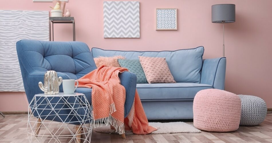
Light and Baby Blue With the Lilac Color
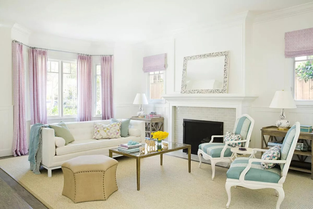 Image source: Corine M.
Lilac is one of the most popular colors that go with light blue for a soothing atmosphere. Their interplay is soft and delicate, but also looks fresh and stylish. To complement both colors, try adding white elements like white curtains and fluffy rugs.
Mixing Dark Blue and Pastel Blue
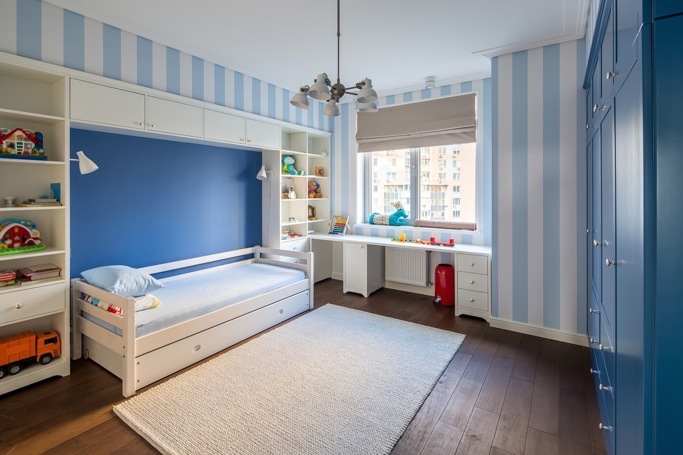 Image source: E & L Star Construction Inc.
Generally, you can combine any lighter shade of blue with its darker shade counterpart. So, even when using a pastel and pale shade, you can contrast it with something like powder blue. Either way, the outcome will be a classy and relaxing scheme, perfect for a bedroom.
Brown With Light Blue
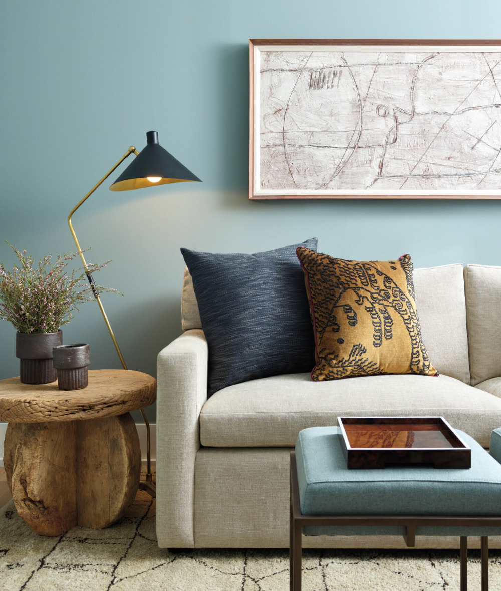 Image source: Luxe Interiors + Design
Brown and blue complement each other by default and remain a classic combo even today. For example, you can use brown hardwood on the floor and stylish leather sofas. Then, you can highlight them by installing light blue on the walls and on the carpets.
Similarly, consider pairing navy blue with a darker shade on the floor for a mid-century look. As for the living room and hallway areas, any tan-brown hue is the right choice for the furniture.
The Silver-Light Blue Combination
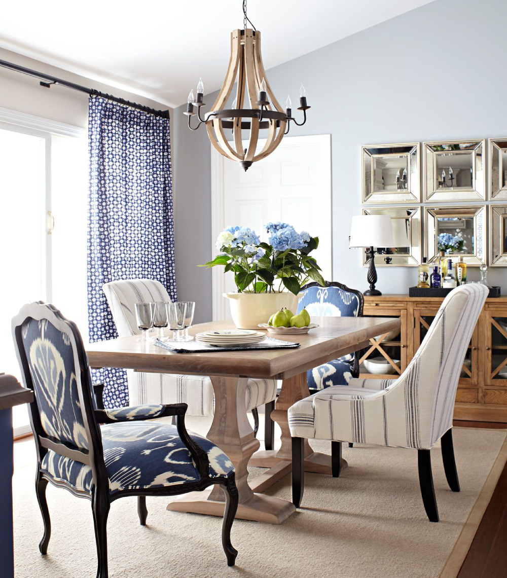 Image source: LAURA MOSS
Silver and blue are another tasteful pair that looks both classic and modern. They gel well with each other and produce a matching intensity. For a balanced outcome, you can introduce the metallic hue with your choice of hanging light fixtures.
Depending on the rest of your setup, you can also use silver frames for the artwork spread across the room. Next, use dark blue as the primary wall paint to contrast those elements. Such an approach works in the bathroom as well. For example, use a steel bathtub next to classic blue tiles.
Combining the Cream Color With Light Blue
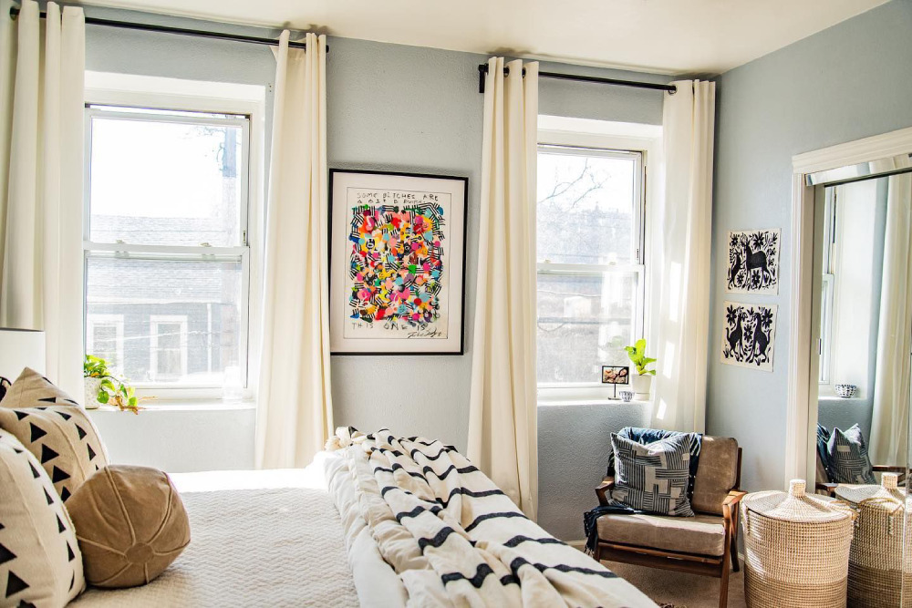 Image source: KACIE COPE INTERIORS
The cream-blue combination screams elegance and is an excellent contemporary choice for a living room. The cream goes with a number of cool colors, though blue is indeed a natural fit for it. The result is a relaxing and balanced chasing of colors that you can use even in your kid’s bedroom.
White With Light Blue
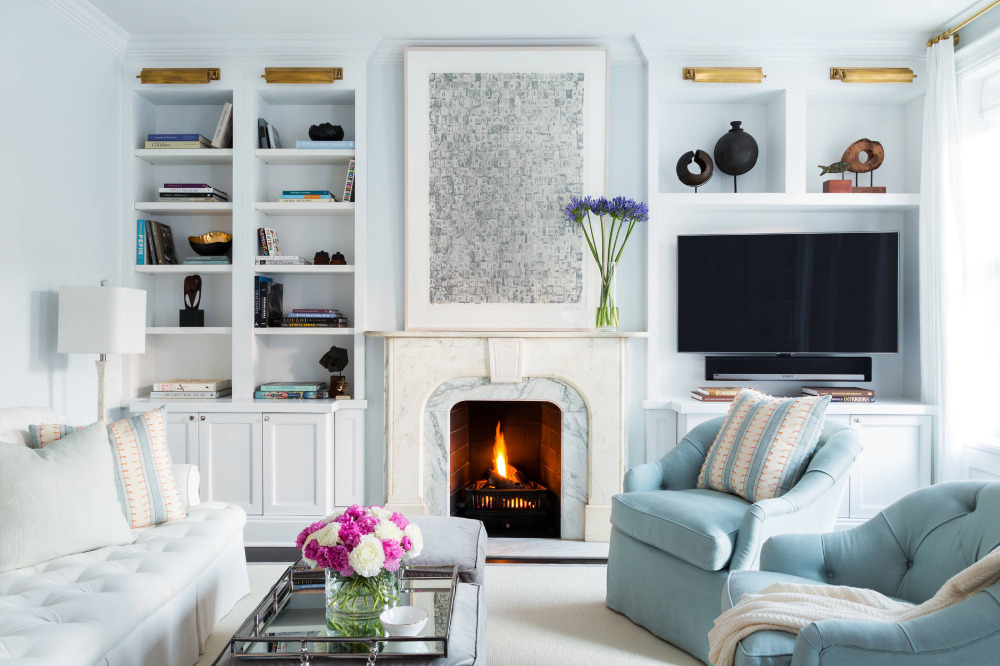 Image source: Chango & Co.
White is an easy pick among the neutral colors that go with light blue. Those two result in a refreshing decor with a predominantly versatile shade. Plus, they’re both natural textures that add to the homeliness of your setup. On that note, the white-and-light blue is an excessively clean color combination as well.
The Peach Color and Light Blue
 Image source: Nerolac
Peach and light blue had their heyday during the 70s, though that color theory can also work today. Whenever together, powder blue and baby blue complement the natural vibes of the peach color greatly. Hence, they mash in a joyful manner with a high fun factor.
The Champagne Color and Light Blue
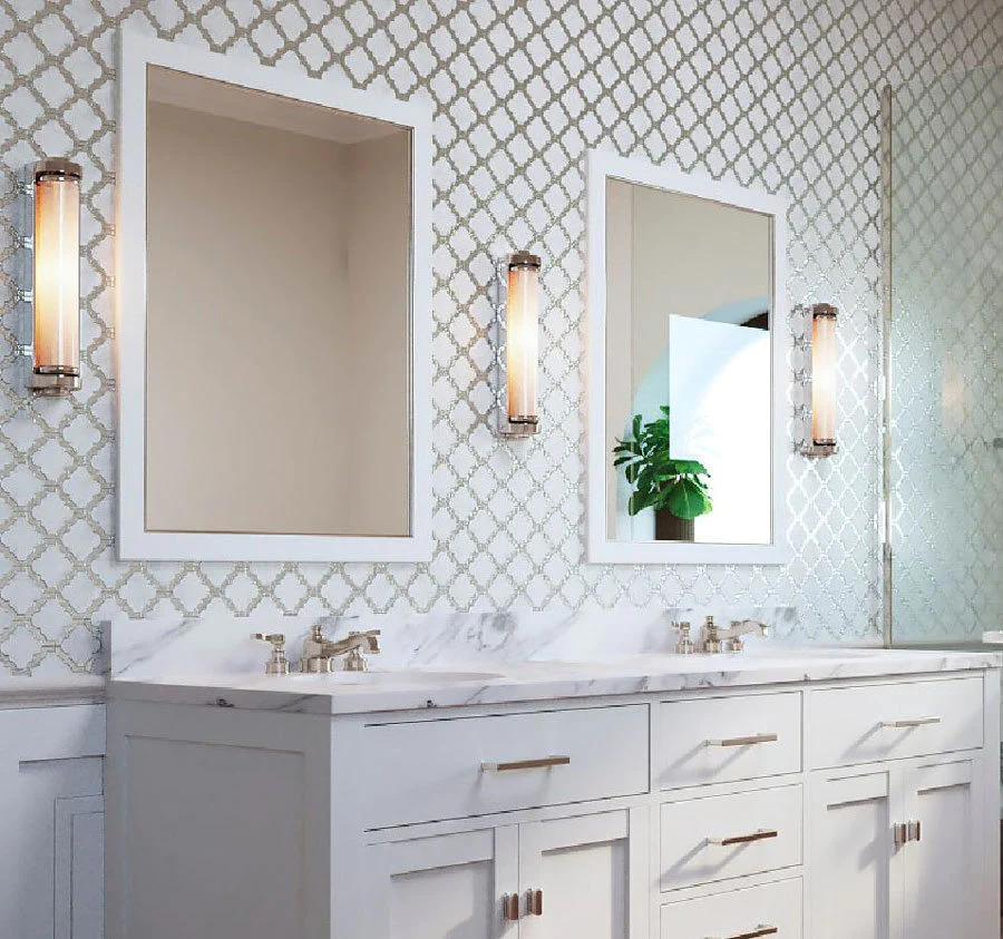 Image source: Tile Club
A glitzier version of beige, the champagne color is an excellent pick for a classy dining room. It’s a type of expensive paint pigment that avoids creating a dramatic contrast like all pastel colors. For example, it serves as the perfect backdrop for a piece of blue upholstered furniture.
On the flip side, champagne elements blend well with a cool wall pain as well. Hence, a champagne frame for your living room mirror looks in place next to a navy blue wall. The same goes for vases and throw pillows of that same color family. Lastly, champagne is a great choice for your bathroom tiles as well.
Bright Orange, Yellow, and Light Blue
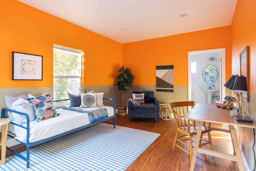 Image source: Christopher Lee Foto
Bright colors complement each other if used in moderation. Pairing bright orange with light blue creates a soft color palette that you can further balance with another focal point. Yellow fits into that color scheme nicely, as well as the bright white hue.
The Emerald Color With Light Blue
 Image source: DULUX
Green and blue are similar primary colors that match without many hiccups. Still, you can take this classic pairing up a nudge by using the emerald and soft blue shades. That way, you’ll produce a nautical theme and impress your guests with the unique dominant color.
If you aim for a more glam and bold approach, add matte black finishes to the setup. Such color combinations are a shortcut to a sleek, fashionable vibe that’s also quite versatile overall.
Mixing Red and Light Blue
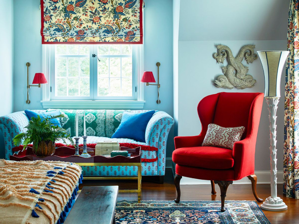 Image source: ERIC PIASECKI
Any interior designer will look for ways to avoid the clash of the red and blue colors, though the two can work together. For example, a space filled with sky blue and other neutral tones can benefit from the intensity of the red color. It easily pops into view, whether you apply it via the carpet or sprinkle it around using several smaller elements.
However, it remains a risky choice for a home decor project. It’s easy to fall into the trap of both colors competing for the spotlight. Thus, be careful how you work the space and decide which hue will take center stage early on.
Pairing Cool Gray With Light Blue
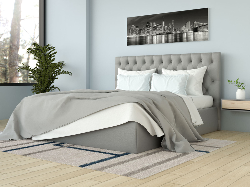 Image source: DULUX
Gray is one of the more elegant colors that go with light blue. They go well in a myriad of places with a given household. For example, you can create a stylish living room by using gray walls and pale blue furniture. Also, a cool gray bedspread goes very well with a handful of blue throw pillows.
If you’ve opted for the darker shades of blue, balance them out with several white touches in between. To that end, try adding a white rug or use a similarly bright color.
Combining Light Blue With Copper and Gold
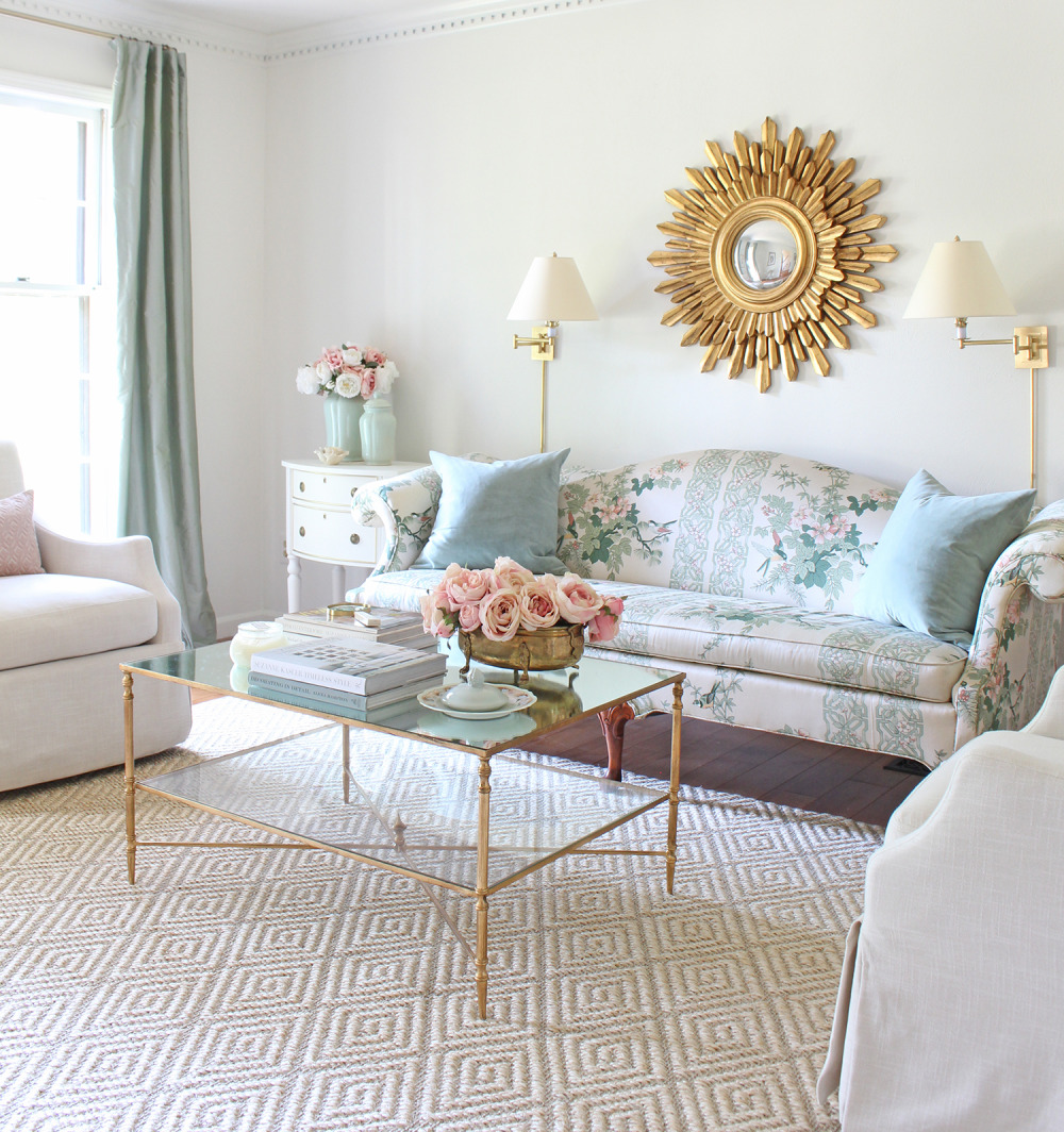 Image source: Tuft and Trim
To add contrast in a meaningful way when implementing light blue wall paint, consider the metallic hues. Copper, gold, and silver will all fit the bill and provide visual interest to the setup.
For instance, light blue has an innate connection with silver, while copper goes with dark blue. You can follow those rules in your bathroom or bedroom areas to great effect.
Using Marigold Next to a Light Blue Wall
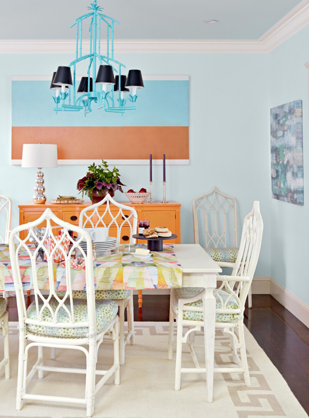 Image source: DAVID TSAY
The marigold color is the perfect shade for warming up the ambiance with high class. In essence, it’s a mixture of gold and burnt orange shade. Hence, using it next to colonial blue elements is a famous vintage approach. For the best results, introduce the blue color via various patterns on the wall or on the floor.
On a similar note, marigold can quickly enliven the room due to its warmth and intensity. So, you can even apply it on the walls for a truly energetic atmosphere. Then, use mostly blue furniture to balance things out.
The Fiery Warm Colors With Light Blue
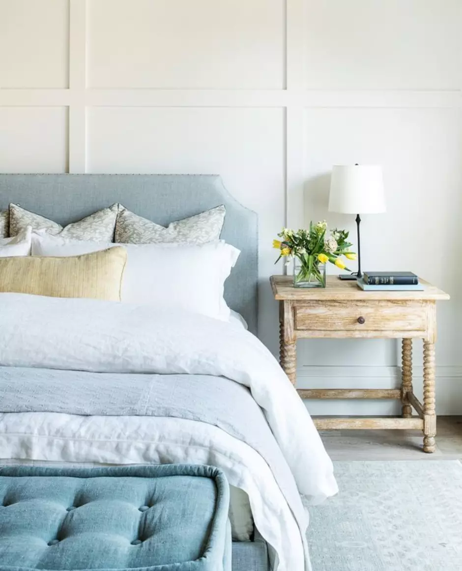 Image source: WHITE SANDS
The clash between the light blue shade with those on the opposite end of the spectrum is attention-grabbing. It’s also a bold interaction that’s often a part of a modern interior design solution. Aside from that, it can be fun and relaxing at the same time. However, it’s easy to cross the line into a too-direct chic style that many will find strange.
One of the riskier pairings to try is the blue-and-red clash. Since both can pass as accent colors, they’ll most likely end up blurring the focus. However, the softer red hues are among the colors that go with light blue. Pink is a good candidate for this match, though opting for its lightest variants is recommended.
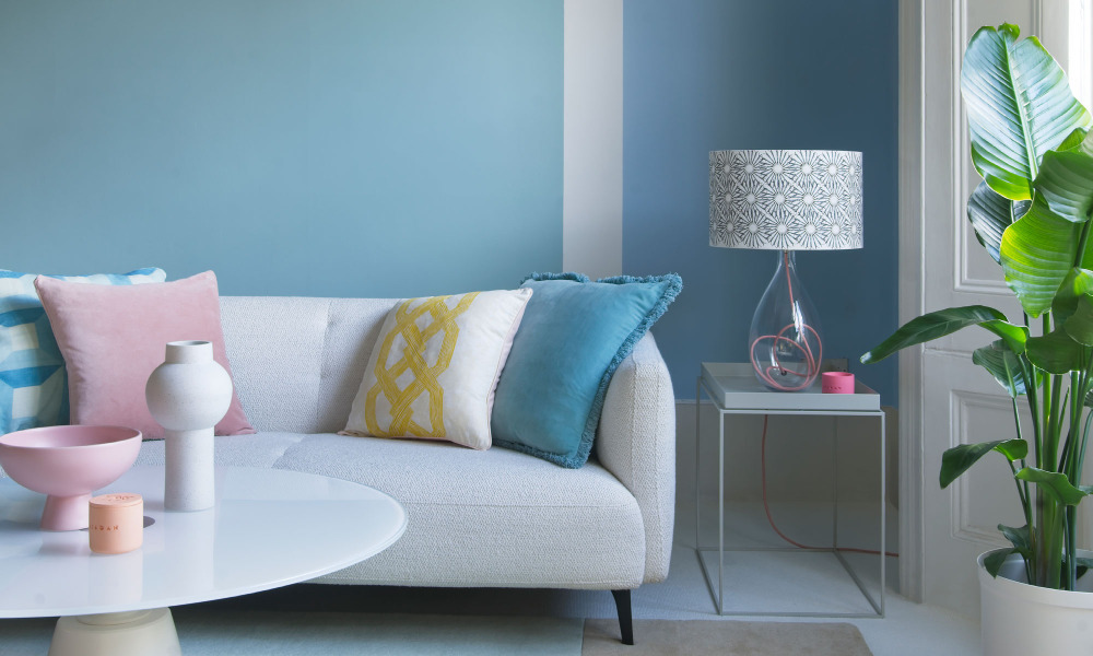
Image source: Dominic Blackmore
Furthermore, the yellow and orange shades are winning choices for warm tones that won’t clash with the blue. The blue and orange interplay is always pleasant to look at and goes with other color combinations as well. In other words, although far on the color wheel, blue and orange actually do complement each other.
FAQ On Colors That Go With Light Blue
What Color Contrasts with Light Blue?
Accent colors like warm coral or terracotta stand bold against light blue. They create a visual energy that is engaging without overpowering the tranquility of light blue. Think of these hues as the zesty twist to your color ensemble.
Is Light Blue a Good Choice for Walls?
Absolutely, particularly in spaces where calmness is key. Light blue walls set a peaceful backdrop for interior design, lending themselves to a myriad of décor themes from contemporary to coastal.
Can Light Blue be Paired with Neutral Colors?
Neutral tones such as beige, white, and grey are harmonious companions for light blue. They build on light blue’s inherent aesthetic light blue pairings, offering a timeless and versatile color scheme that suits any setting.
How Does Light Blue Affect Room Size Perception?
Light blue, with its airy quality, can make rooms appear more spacious. Wall paint combinations using light blue can visually push back walls, especially in well-lit areas, enhancing the openness.
What are Complementary Colors for Light Blue in Fashion?
For a wardrobe wonder, pair light blue with a soft pink or a subtle mint green. These color coordination choices reflect a contemporary and sophisticated palette while maintaining a fresh, youthful vibe.
Which Metals Go Well with Light Blue?
Silver and brushed nickel are stellar with light blue. They echo its cool undertones, bringing a sleek and modern touch to home decor or fashion design elements.
What are Analogous Colors to Light Blue?
Look no further than the color wheel for a selection of soothing blues and greens. Analogous colors like teal or turquoise maintain the color story’s flow while adding depth to the visual composition.
What Colors Suit a Light Blue Wedding Theme?
A light blue wedding theme revels in the romance of pastel pairings. Sprinkle in hues of pale lavender and soft gold for a dreamlike ambiance that’s visually harmonious and tender.
How to Create a Monochromatic Light Blue Palette?
Begin with light blue and venture into its variations—celestial blue, powder blue, and ice blue. By exploring the subtleties within blue tones, you curate a refined and cohesive palette.
Can Light Blue Work as a Brand Color?
In crafting a corporate branding identity, light blue stands for trust and reliability. Pair it with crisp white or bold navy to establish a professional, yet approachable brand image.
Conclusion
The journey through the serene world of colors that go with light blue culminates here, amidst a creative confluence of hues that have the power to invoke a spectrum of emotions.
- Light blue, a color of tranquility, has revealed its affinity for companions that either softly whisper alongside it or boldly declare their contrasting stories.
- From the lush embrace of mint green to the grounded stability of grey, every combination we have explored offers a unique narrative to a space.
- These pairings are not mere visual delights; they also speak to personal preferences and functional design, effortlessly weaving into the arrangements of home decor, fashion, and even website design.
As you step forward, armed with the knowledge of these congenial color dynamics, remember that the true essence of any design lies in the pleasure it brings to those who experience it. So, let the light blue be your muse, and the color wheel your guide, as you paint your world with the colors that resonate most profoundly with your vision.