Imagine your space infused with the warmth of a smoldering sunset. The rich tapestry of burnt orange weaves an inviting aura that’s both bold and cozy. This transformative hue can encapsulate the essence of a fall harvest or the last whisper of daylight.
In the palette of an interior designer, colors are not just a choice but a narrative. It’s the warm color palette and the earth tone colors that become my allies, transforming spaces into experiences.
With burnt orange as the vibrant anchor, I’ll guide you through an exploration of color harmony, introducing complementary colors, and the analogous colors that align with it flawlessly.
By journey’s end, you’ll not only be familiar with a spectrum of coordinating colors with orange, but you’ll visualize your domain through an enriched lens.
Articulate in the language of hues like rust, amber, and terracotta, you will have curated your canvas. Dive in as we unlock a chromatic symphony tuned to the key of burnt orange.
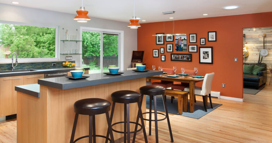
Colors That Go With Burnt Orange
| Colors that Go with Burnt Orange | Visual Contrast | Mood/Ambiance | Ideal Usage | Complementary Colors |
|---|---|---|---|---|
| Cream or Beige | Low | Warm, Welcoming | Interior walls, accents in fashion and design | Dark Greens, Blues |
| Dark Brown | Moderate | Earthy, Rich | Leather goods, furniture, fall fashion | Blues, Teal |
| Teal | High | Vibrant, Energetic | Accent walls, decorative accessories | Beige, Cream, Grey |
| Grey | Variable | Modern, Sophisticated | Home decor, office environments | White, Black |
| Navy Blue | High | Classic, Trustworthy | Professional attire, web design | White, Metallic shades |
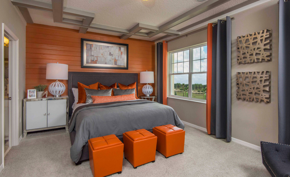 Image source: Masterpiece Design Group
For a warm and inviting look, consider pairing burnt orange with complementary colors like yellow, beige, cream, tan, taupe, and light brown. Opt for cool colors like gray, navy, teal, and white to create a more modern look.
Generally, pairing burnt orange with bright colors like pink, purple, and royal blue is a tasteful approach. Together, they produce a bold and vibrant look. Hence, there are plenty of ways to introduce the color burnt orange to your living room setup.
Aqua With Burnt Orange Color – Ocean Vibes & Sunsets
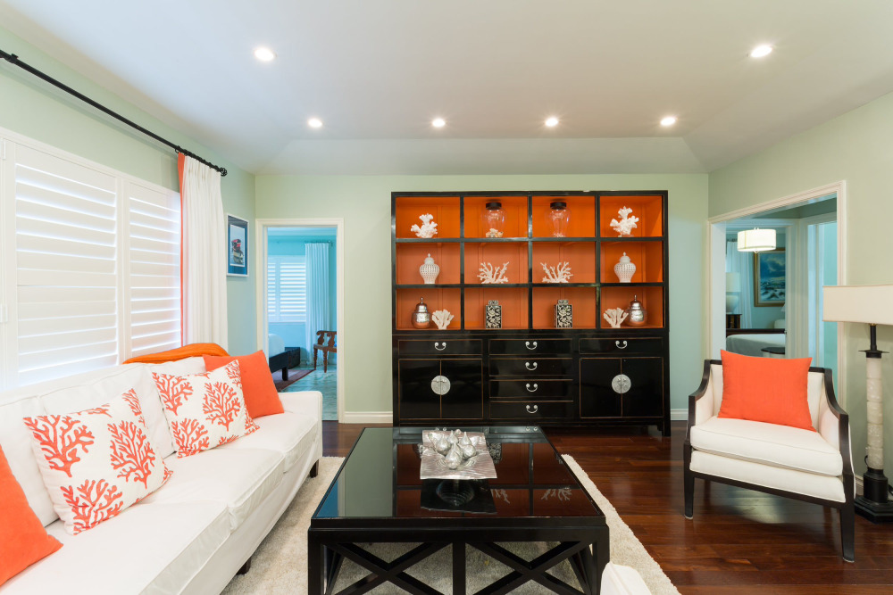 Image source: Margaux Interiors
It is a beautiful combination that makes the room look fresh and cool. To that end, try painting the walls in a light aqua shade and add accent pieces in burnt orange. Next, throw a blanket, a rug, some pillows, or even artwork with similar shapes.
Combination of Purple and Burnt Orange
 Image source: Chandler Prewitt Interior Design
Purple and orange are complementary colors; therefore, you can pair burnt orange with all shades of purple. For example, pair deep purple walls with burnt orange furniture to create a comfortable and inviting atmosphere. To add some contrast, you can also use lighter shades of both colors to introduce balance to the space.
Beige and Burnt Orange – Creamy and Cozy Atmosphere
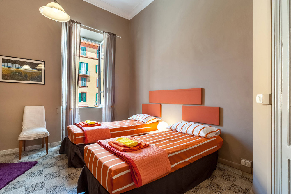 Image source: Stefano Musa Fotografo
Beige is one of the neutral colors that go with an orange tint. Beige shades vary from sandy tones to bright gray ones. However, when paired with burnt orange walls, beige creates a luminous look in the room. Then, you can accent those colors with paint and accessories like beige and burnt orange pillows.
A Mixture of Black Tones and Burnt Orange Color
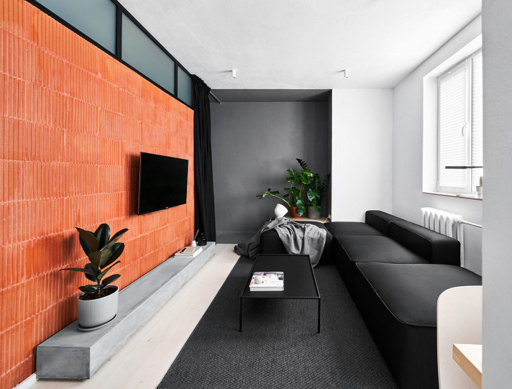 Image source: Line Design Studio
Black and burnt orange can create a bold, statement-making color palette. Try pairing black and burnt orange walls with white furnishings and accents for a modern, fashionable look. Similarly, consider mixing and matching shades of the two colors for a more eclectic, bohemian feel.
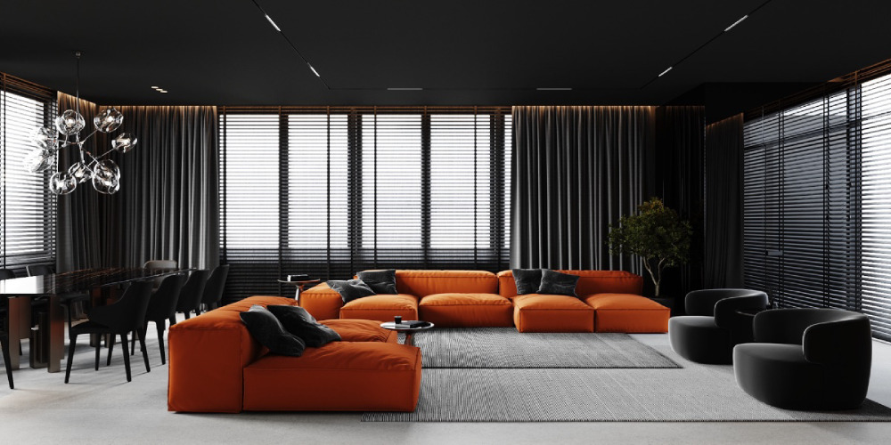 Image source: AXIA /design studio
Lastly, introduce more texture by using throw pillows and blankets to add visual interest and warmth.
How Well Does Teal Go With Shades of Orange?
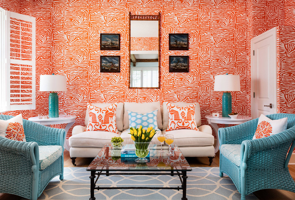 Image source: Gil Walsh Interiors
Teal is a blue-green hue that adds a fresh and modern feel to any room, while burnt orange is a warm and inviting hue that can liven up any space.
Together, these colors can create an attractive and stylish atmosphere. Such a pairing can produce a bold and eye-catching look when used in a minimalist design. For example, try painting the walls teal and adding burnt orange drapes or furniture to create a warm tone for your living room.
Bland Cream with Burnt Orange
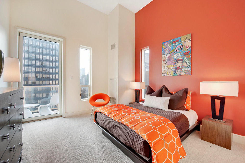 Image source: Nancy Pearson Design
All the creamy shades are a soft hue under natural light. Therefore, the cream works best as a background color.
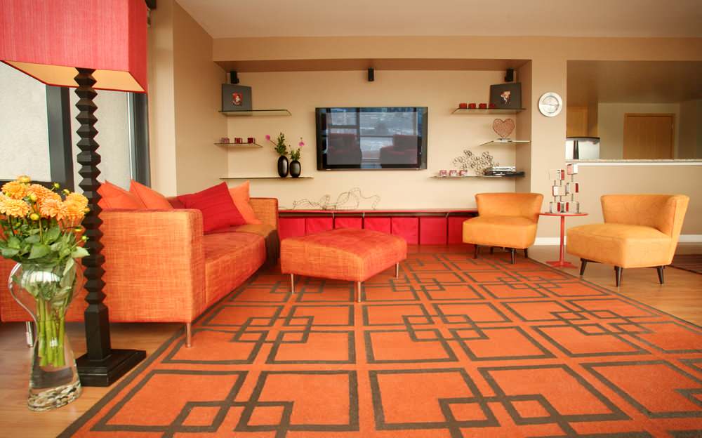 Image source: Susan Diana Harris Interior Design
In contrast, an orange color scheme results in statement pieces and accent colors. So, burnt orange is a vibrant color, making this combo warm by default.
Taupe & Burnt Orange?
 Image source: Mark English Architects, AIA
Taupe makes a great base color for burnt orange accents. You could use it on walls, floors, furniture, or even accessories. Taupe can also tone down an area with burnt orange accents.
For example, if you have burnt orange furniture, you could use taupe curtains or wall art to balance out the look. Thus, let burnt orange take the first row while using taupe as support.
The Lashing Chocolate Brown With Burnt Orange
 Image source: GIL WALSH INTERIORS
This combination is the perfect fit if you want to add elegance and grandeur to your formal living room or dining room. Orange home decor and a mixture of chocolate brown tones will bring richness to the space. Also, try adding silk and gold accents to complete the look.
How Well Does Dark Navy Go with Burnt Orange in Living Spaces?
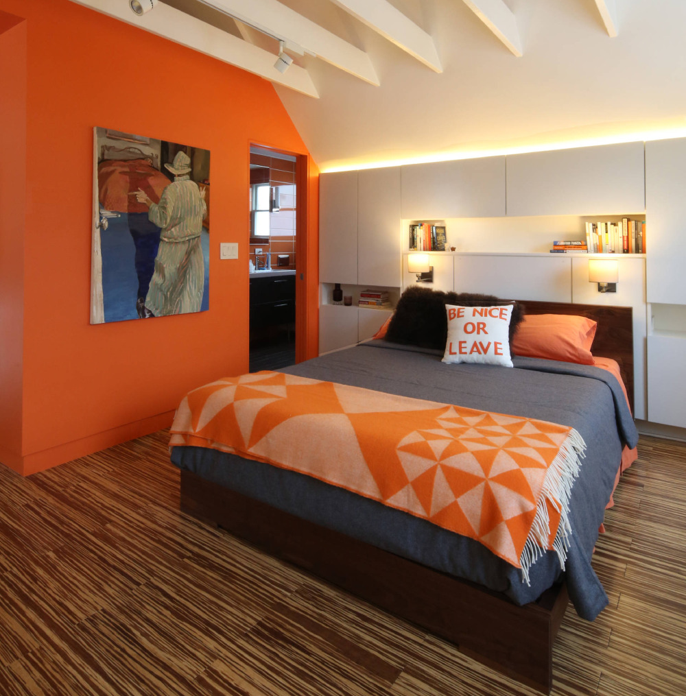 Image source: 30E design + architecture
The burnt orange evokes warmth, while the navy adds a touch of sophistication. This combination is perfect for a more casual, everyday style. You can also pair the two colors with neutrals such as white or gray for a more formal outcome.
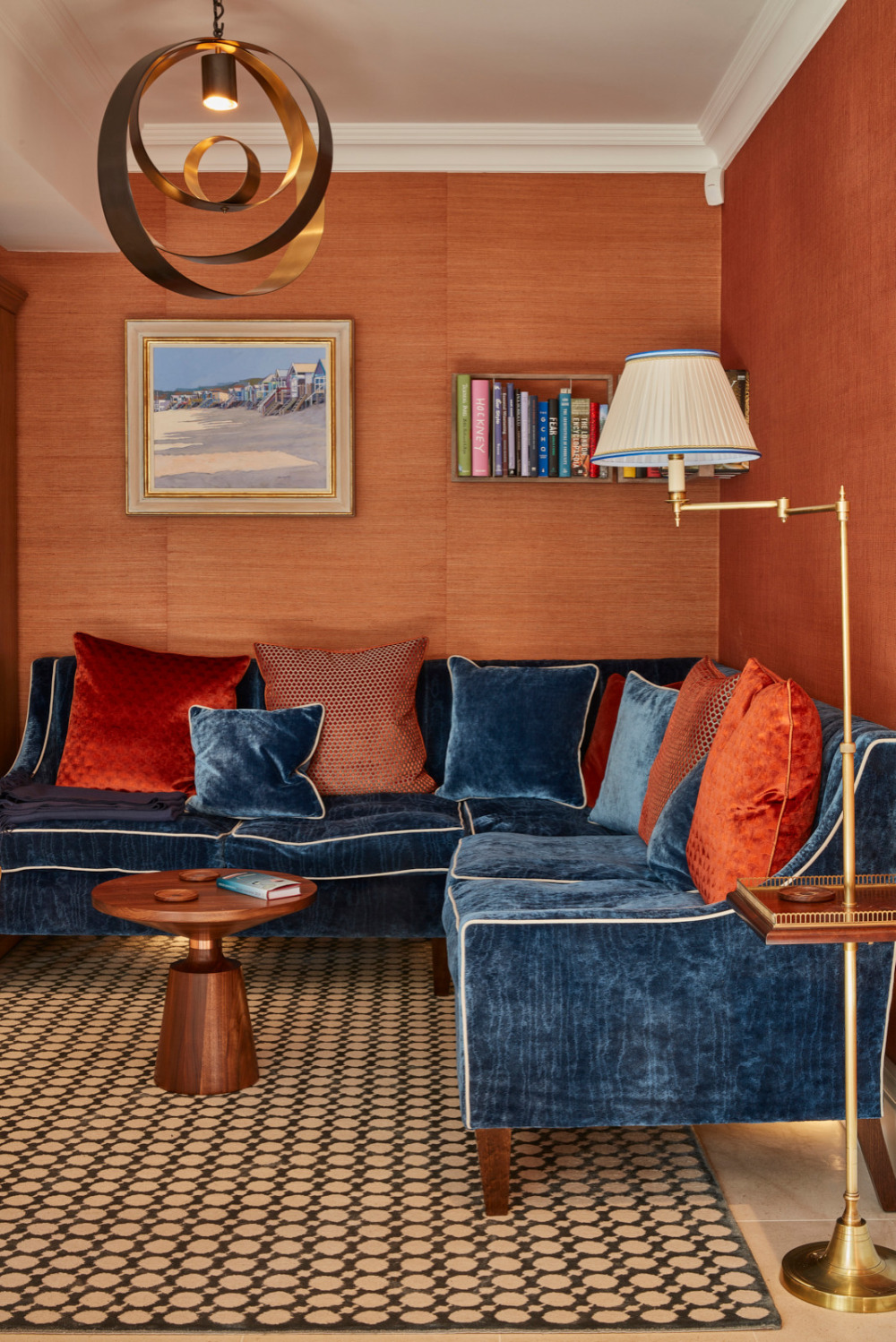 Image source: Floren Design Ltd.
Alternatively, mix them with bright colors for a fun and modern look. On the other hand, if you’re shooting for a darker look, the lovely dark blue will fit right on with bright orange or a burnt shade.
Olive Green Color Wheel Paired Up With Burnt Orange
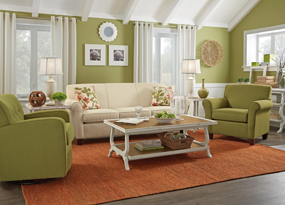 Image source: Woodchuck’s Fine Furniture & Decor
Olive Green tones go with orange ones by default due to their earthly nature. Pairing orange tones, especially burnt orange, with olive green, produces a warm and light vibe. So, you can alternate between such ends on the spectrum to achieve your desired look.
If you want a more prescient look, then using olive green as a primary color will bring out the natural feel. Similarly, if you are up for a bolder look, you should utilize burnt orange as your primary color.
Such colors complement each other and will make a cozy and inviting atmosphere. You can add accents of white or cream to add a bit of contrast and to lighten up the space. This color combination looks great in a living room, bedroom, or dining room.
Conclusion On Colors That Go With Burnt Orange
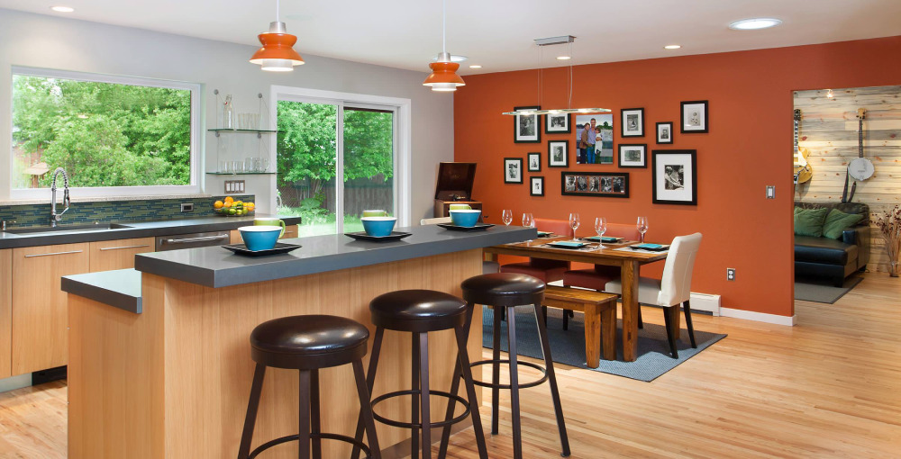 Image source: WORKSHOP8 architecture planning design
Did you know that there are more than 240 hues of orange? Nevertheless, only a few are used in interior design, such as bright orange, muted orange, or burnt orange hues. Bright orange hues like tangerine, coral, and vermilion tend to be on the warmer side. Muted oranges are more earthy, such as terra cotta, rust, and burnt sienna.
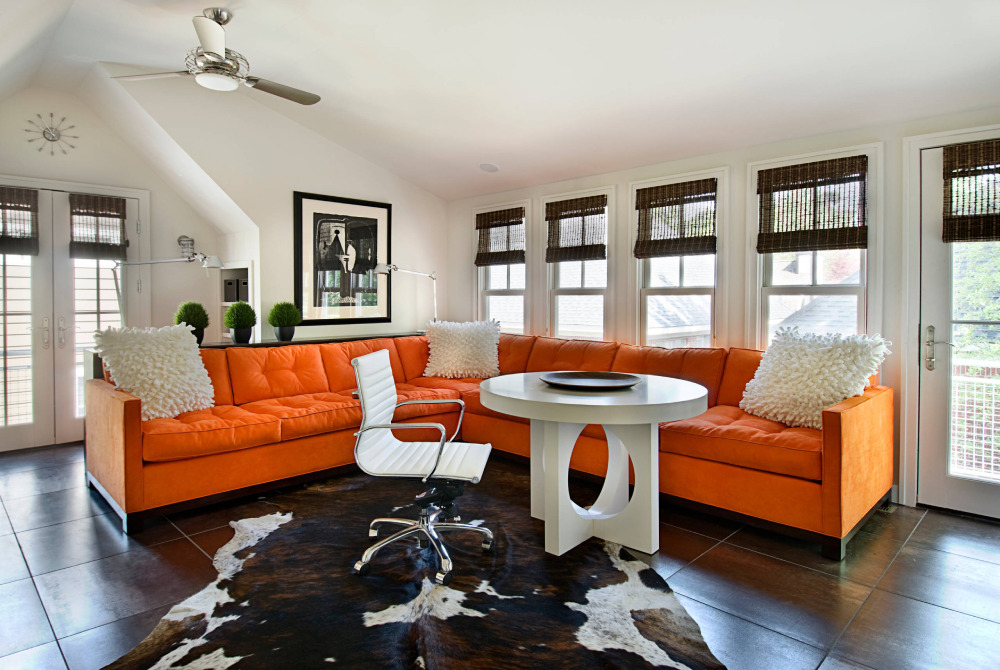 Image source: AMW Design Studio
If you were planning to renovate and decided to utilize orange in your home, then all of the above color schemes are decent choices. No matter what color you choose to pair with your burnt orange room, create a space that expresses your personality and reflects your style.
FAQ On Colors That Go With Burnt Orange
What is the Best Complementary Color for Burnt Orange?
Burnt orange bursts to life when paired with a deep blue. This combination is a classic example of using color wheel opposites to create striking contrast. It resonates with the sharp coolness of the ocean’s depth against a warm autumn shade.
Can Burnt Orange Work Well in a Minimalist Setting?
Absolutely. When designing minimalist spaces, burnt orange can serve as a statement accent color. Surrounded by neutrals such as soft whites or grays, it adds a pop without overwhelming the aesthetic room colors fundamental to minimalist design.
How Do I Incorporate Burnt Orange into My Wedding Theme?
Vision a seasonal palette; burnt orange partners exquisitely with creams and greens for a rustic autumn wedding. Flowers, bridesmaid dresses, and table decor embodying this palette will enchant with an earth tone elegance.
Which Paint Colors Complement Burnt Orange for a Cozy Room Feel?
Think shades like olive green, taupe, or a warm beige. Such colors harmonize with burnt orange to create an embracing, cozy atmosphere. They’re part of a rich autumn shades family, perfect for crafting a snug retreat.
What Colors Go with Burnt Orange for a Modern Kitchen?
Metals like stainless steel and hues such as charcoal or slate gray offer a sleek, modern contrast. Terracotta color scheme tiles could give a nod to tradition, while warm color palette accessories keep the feel contemporary.
Does Burnt Orange Pair Well with Wood Finishes?
It does more than just pair; it thrives. From light oak to dark walnut, wood finishes and burnt orange share an intrinsic connection through their natural earth tone colors DNA. They bring out each other’s warmth, enhancing the cozy color scheme.
How Can I Style Burnt Orange in My Wardrobe?
For a standout look, combine burnt orange with navy or burgundy. For a subtle, fashion color trend approach, wear it with camel or khaki. Burnt orange accessories like scarves or bags are superb for a touch of warmth.
What Color Curtains Match with Burnt Orange Walls?
Cream or ivory curtains provide a soft, light contrast to burnt orange walls, highlighting the hue, saturation, and brightness without stark opposition. They frame your windows as artworks, draped in complementary cloud-like whispers.
Which Colors Go with Burnt Orange for Digital Design?
In digital landscapes, teal and burnt orange form a vibrant yet balanced duo. The addition of off-whites and soft grays can moderate the palette.
These contrast in colors and create a visually engaging digital environment, resonating with the principles of color psychology in design.
Can Burnt Orange Be Used in Branding and Logo Design?
Indeed, burnt orange is memorable for branding. It can be the core of an energetic color scheme when combined with dark gray or black for text. More than just a fade color combination, this can embody a brand’s voice, energetic and forward-thinking.
Conclusion
As sunlight fades, painting the sky in a myriad of burnt orange, it’s undeniable how this hue captures the imagination. A journey into the world of colors that go with burnt orange isn’t just about aesthetics; it’s about setting a mood, telling a story, crafting an ambience where every shade is a character.
- Earth tones ground us.
- Complementary blues bring a dash of cool to the warmth.
- Neutral ivories offer balance, breathing space.
Incorporating this fiery shade into any space or wardrobe requires a thoughtful approach to color harmony. Through this exploration, the hope is to have sparked inspiration; to help paint everyday life with the bold strokes that only burnt orange can provide. It’s not just a color; it’s an invitation—to toast to traditions, to bask in a glow of warmth, to live vibrantly amid rich autumn shades and the terracotta color scheme. The canvas awaits, let the brushstrokes of creativity flow.