Imagine unwrapping the earthy essence of knotty pine in your personal space—the quintessential conundrum of design. Draped in nature’s fingerprints, each knot and swirl tells a tale of cozy rustic charm, democratizing the warmth of a cabin core in your own abode.
Colors that go with knotty pine are not just complementary hues; they are the silent narrators that enhance its natural beauty. As an interior design connoisseur, unearthing these hues is akin to selecting the perfect ensemble for an exquisite masterpiece.
This article shall be your guiding light through a chromatic journey, marrying the vintage allure of knotty pine with a modern palette that breathes life into any room.
Within these curated paragraphs, expect immersion into the principles of color theory and interior design. The journey will unravel how tertiary colors, neutral shades, and earth tones can transform your space into a tableau of comfort and style.
By the finale, not only will you be armed with a wealth of color swatches and paint ideas, but the once elusive confidence to revolutionize your space will become second nature.
Colors That Go With Knotty Pine
| Colors That Go with Knotty Pine | Warmth | Contrast Level | Ideal Usage | Visual Effect |
|---|---|---|---|---|
| Warm Whites | High | Low | Walls, ceilings, trim, accent pieces | Creates a seamless, cohesive look with the woodwork |
| Soft Greens | Medium | Medium | Walls, accent details | Brings a natural, earthy vibe complementing the pine |
| Earthy Browns | High | Low to Medium | Furniture, flooring, accessories | Enhances the rustic character of the knotty pine |
| Slate Blue/Grey | Low | High | Walls, accent walls, textiles | Provides a modern contrast to the warm pine tones |
| Warm Creams or Beiges | High | Low | Walls, large surfaces, upholstery | Offers a soft, neutral background for the wood |
Combining Sage Green and Knotty Pine Wood Paneling
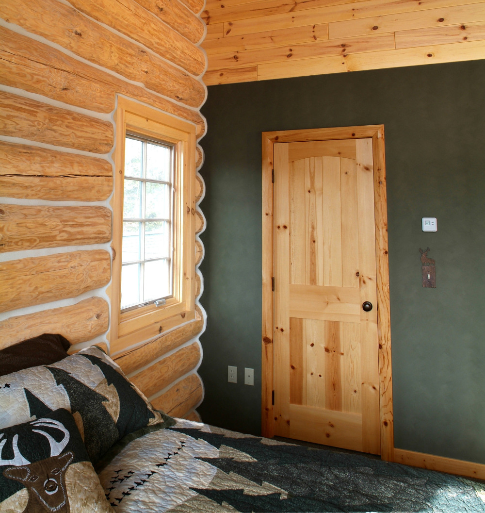 Image source: Woodhaven Log & Lumber
Sage green allows the beauty of the natural wood texture to shine without providing a dramatic contrast. Instead, sage green wall paint is one the best pairings for a knotty pine ceiling. Also, consider using this tone on the carpet and on the bed covers.
 Image source: Woodhaven Log & Lumber
Other than that, this traditional paneling style goes well with sage green door and window frames. In such setups, the wood appears as the focal point of the room, as multiple designer tips point out.
The White Wall Color and the Warm Shades of Knotty Pine
 Image source: STUDIO-E Architecture
White is the most versatile among the colors that go with knotty pine. Plus, it results in a crisp look that subtly contrasts the natural wood tones. Thus, you can freely combine white wall paint with existing knotty pine walls for a mid-century modern kitchen.
Pairing Knotty Pine With Similar Natural Tones
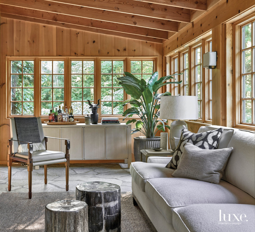 Image source: Lixe Interiors + Design
Wood can have a complex texture that makes combining different wooden materials a worthwhile effort. Hence, you can play around with the various stains and grain patterns to great effect. Also, you could apply varnishes to end up with fancy rustic cabins.
Nowadays, you can find a decent number of materials with warm tones like mahogany, walnut, maple, etc. In time, such flooring material will gain a rich patina that installs a classy look. Thus, the dominant yellow undertones won’t linger in the forefront forever.
 Image source: Blue Lotus Home Designs
With that said, consider the primary color of the other wood pattern before deciding whether it goes with knotty pine. At that point, settle for either a high or low-contrasting choice. However, note that later on, the textures of mixed woods will blend together, producing a comfortable ambiance.
Blue Country Kitchens and Knotty Pine Wood
 Image source: The Cabinet en-Counter, Inc.
Country blue is one of the hues that pair nicely with a wooden backdrop by contrasting it. Although a bold pairing, cool colors like country blue look elegant in a rustic look. Then, you can subtly enrich the space with some off-white elements.
The Black and Knotty Pine Combination
 Image source: Hull Forest Products – Wide Plank Floors
Black is among the sleekest colors that go with knotty pine and other natural wood materials. Some of the more popular solutions include orange knotty pine, which is a great match for black wall paint. For example, you can use black window frames and accentuate the knot pattern with light fixtures.
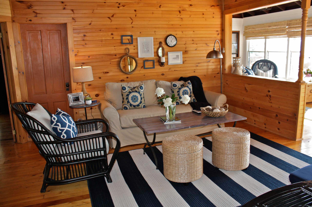 Image source: Ally Whalen Design
Similarly, black-laced furniture looks great in front of any neutral colors by default. Hence, you can produce several stylish combinations involving these two shades.
Pairing Dark Green and Knotty Pine
 Image source: Laurey W. Glenn
For a woodsy scenery, use dark green color next to knotty pine walls. Also, knotty redwood flooring is a great base for a fresher hue on the walls. Together, they can produce an interesting and warm rustic look.
The Yellow Color and Knotty Pine
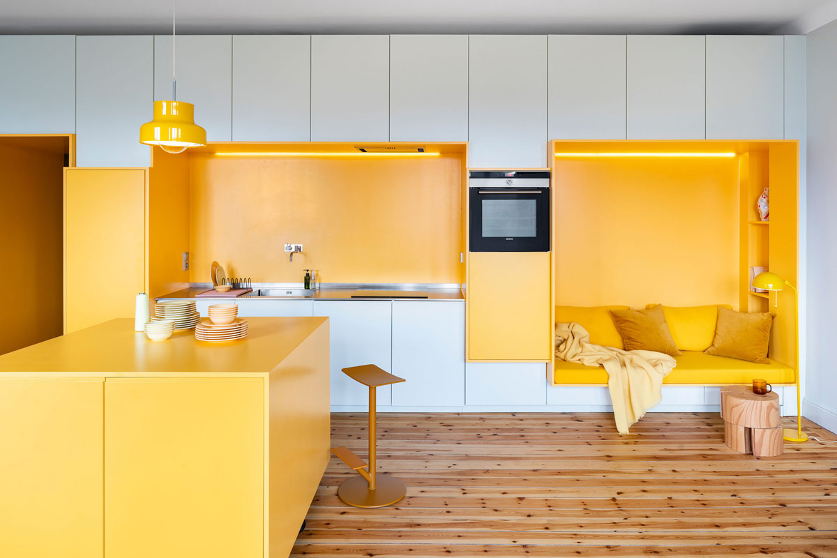 Image source: Lookofsky Architecture
From the get-go, any knotty pine cabin calls for a splash of a bright yellow hue. Their pairing alludes to summer days and looks vivid under natural light. At the same time, the yellow color alters the scenery to a more feminine and cozy outcome.
Contrasting Knotty Pine With Navy Blue
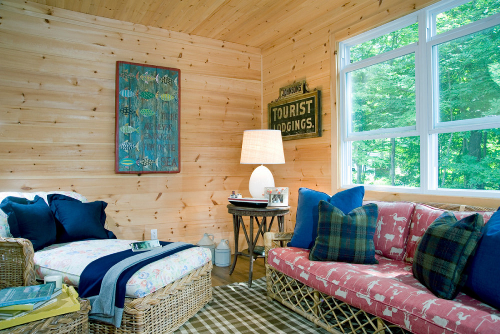 Image source: KellyBaron
When shopping for an airy and open setup, use navy blue with knotty pine walls. This deeper shade allows the natural textures of the wood to become focal points. Thus, it supports their innate warmth by contrasting them without clashing.
To that end, you can introduce navy blue with your choice of furniture or with the rug. Next, use white wall paint on some of the corners for more visual flair. Lastly, you can get navy blue kitchen appliances for a unique dining room as well.
Mixing Pastel Yellow With Knotty Pine
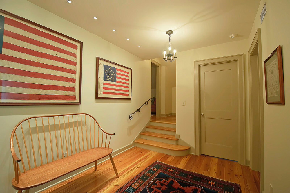 Image source: Spencer-Abbott, Inc.
Since pine wood provides muted yellow shades with its textures, it’s a great fit for a softer paint color. That way, you’ll create a recurring contrast that complements both colors.
Knotty Pine With the Country Blue Color
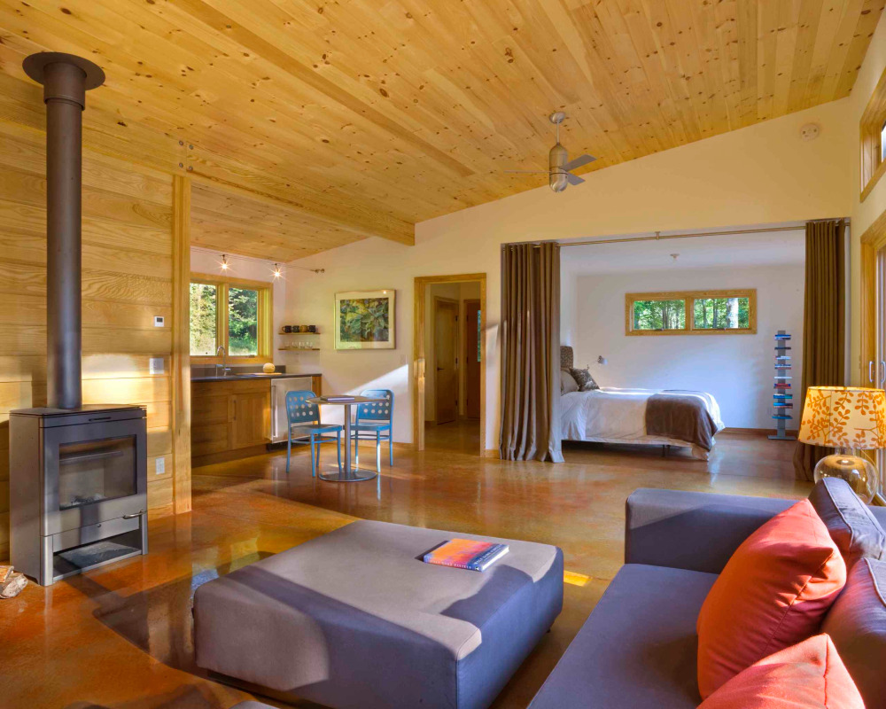 Image source: Joan Heaton Architects
For a bolder pairing that nevertheless looks trendy, consider using a country blue color next to knotty pine walls. The result is a fun interplay between two contrasting hues that’s perfect for any room in your household.
Pairing Teal and Knotty Pine
 Image source: Design Theory Interiors of California, Inc
Teal and knotty pine are a tasteful pair that fit into any rustic scheme. When together, teal brings elements of freshness and looks whimsical next to the neutral wood tint. However, use teal in the furniture only so as to not oversaturate the space.
Does the Dark Red Color Go With Knotty Pine?
 Image source: Waters Edge Woods
This is a shortcut to a warm and inviting living room setup. Although pine has light reddish hues in its patterns, they’re soft enough to contrast the deep red color. The result is a homely decor that you’ll love spending time in.
Combining Gray and Knotty Pine
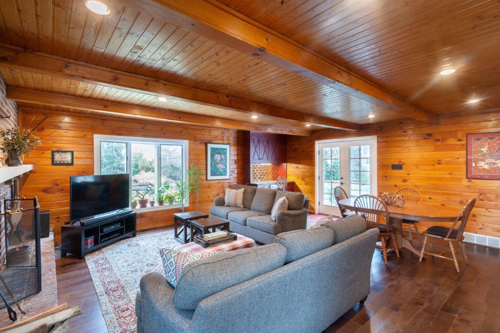 Image source: Dee Hurford Designs
Gray is a reliable cool shade that can complete any rustic setup in style. So, if you’re using pine wood in a room, ensure to break up the monotony with dashes of a light gray color. Greige is another equally elegant choice that also plays into the rustic theme.
The Forest Green Color With Knotty Pine
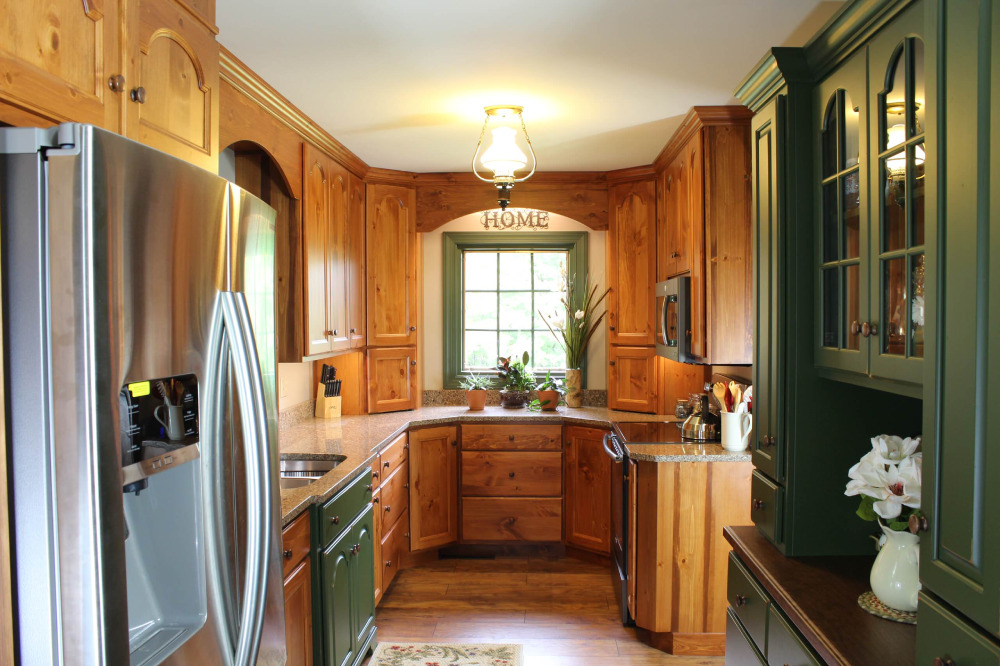 Image source: Creation Cabinetry
Fans of the wainscotting interior design style should consider the forest green-knotty pine combo. This is one of the prettiest matches for white walls and soft brown furniture. Next, add some art pieces with muted colors to enhance the end result.
Pairing Bright Red and Knotty Pine
 Image source: Anthemion Architecture LLC
The bright red hue mixes with the natural warmth of the pine wood to an aesthetically pleasing effect. Such colors won’t overpower each other and will only enliven the space wherever applied.
The Taupe and Knotty Pine Combo
 Image source: Blue Sky Building Company
The taupe tint belongs next to a deeper shade, so choose a darker knotty pine variant to balance things out. For example, a material with stark red stains. Then, introduce a third softer hue to harmonize their interaction.
The Purple Color With Knotty Pine
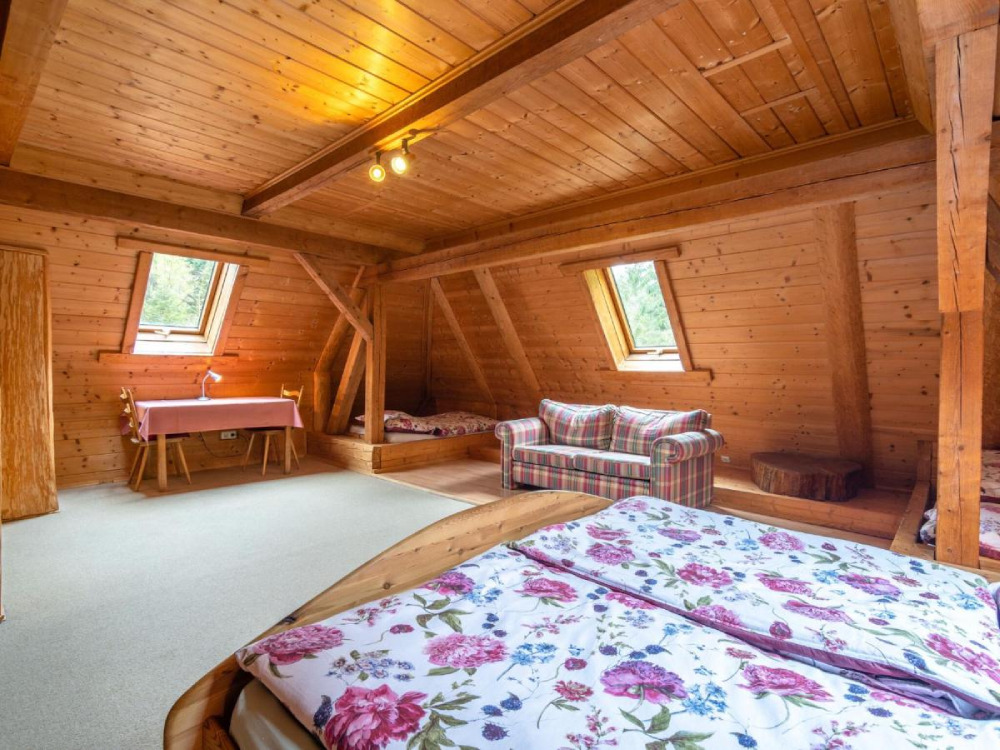 Image source: The Tongue & Groove Store
Purple is a bold, direct color that goes very well with a neutral tone. When it comes to knotty pine, you can apply both lighter and deeper purple shades to complement it. Either way, you’ll produce a stable color scheme that looks comfortable and inviting.
Highlighting the Knotty Pine Tones With Subtle Ivory Elements
 Image source: DHV Architects
Ivory is a unique off-white variant that has an astounding level of versatility. As such, you can use it in practically any room of the house. This soft-brown tint looks welcoming on the walls and carpets, or you can use it as a classy furniture overlay. For example, a comfy, wide ivory couch looks fashionable and rustic in front of a newly-set knotty pine backdrop.
FAQ On Colors That Go With Knotty Pine
What Paint Colors Complement Knotty Pine Walls?
Reviving knotty pine walls calls for a palette that harmonizes without overpowering. Think soft neutral shades like creamy whites or beiges.
These hues make the room feel airy while highlighting the pine’s rich textures, ideal for creating that desired cozy ambiance that resonates with nature’s own aesthetic.
Is it possible to pair Bold Colors with Knotty Pine?
Absolutely, bold colors like navy or emerald can create a stunning contrast against the rustic backdrop of knotty pine.
It’s about balance—using these as accent colors can anchor the space and draw attention to the vintage color trends that flatter the wood’s natural wood colors.
Can I use Light Colors in a Room with Knotty Pine?
Light colors work wonders with knotty pine, reflecting more light and making the space seem larger.
Consider pale blues or greens that mimic the outdoors, implementing a color matching strategy for a serene and harmonious room color psychology that enhances the knotty pine without competing with it.
How do Earth Tones Affect Rooms with Knotty Pine?
Earth tones are knotty pine’s soul mate. They echo the inherent rustic color scheme of the wood, offering a seamless extension of nature inside.
Chocolate browns or sage greens tie together a wood paneling look, ensuring the walls and décor feel cohesive and grounded.
Are Gray Tones Suitable for Rooms with Knotty Pine?
Greys, particularly warmer tones, can be the knotty pine decor‘s modern twist. They provide a subtle contrast that’s both elegant and under-stated, forging a backdrop that allows the wood’s character to take center stage, all while keeping the room feeling contemporary and fresh.
How can White be Used in Knotty Pine Rooms without looking Stark?
Selecting an off-white with warmer undertones is key; think ivory or eggshell. These paint finish options soften the contrast and provide a light, neutral canvas that amplifies interior paint recommendations for a more inviting space that doesn’t go cold against the warmth of knotty pine.
What are the Best Color Strategies for Knotty Pine Kitchens?
In the kitchen, where cabinets and walls often showcase knotty pine, a consistent color strategy is pivotal. Aim for warm color palettes like terracotta or warm yellows for walls.
This enlivens the space without clashing with the cabinetry, adhering to interior design principles that advocate cohesion and warmth.
Can I Use Pastel Colors with Knotty Pine?
Pastels bring a light, whimsical touch to the robust nature of knotty pine. Soft lavenders or mints can add a breath of freshness, particularly in spaces that crave a delicate touch. Think of pastels as a nuanced counterpoint that gently complements the wood’s rugged charm.
What Accent Colors Work Best with Knotty Pine Furniture?
When it comes to furniture color coordination, opt for deep reds, burnt oranges, or even blues. These can enliven the space, offering striking pockets of color that enhance the knotty pine’s natural palette.
Using these colors in decorative accents adds a layer of depth to your room.
How do I Choose the Right Paint Sheen for Knotty Pine?
The sheen can impact the ambiance just as much as the color. A satin or eggshell finish is often recommended; it provides a subtle sheen that plays well with light without being too glossy.
This choice affirms the vintage aesthetic while making maintenance a breeze, especially in high-traffic areas.
Conclusion
Weaving together the fabric of design with colors that go with knotty pine has taken us on an illuminating expedition. From the earth’s palette, we’ve handpicked every hue with intention, ensuring room color psychology and interior design principles work in unison to celebrate the wood’s innate charm.
In closing:
- Neutral shades have emerged as the harmonious canvas, amplifying the space’s natural luminosity.
- Bold accents have shown their prowess in punctuating the knotty textures with contemporary flair.
- Earth tones have underscored their kinship to pine, bringing forth the whispers of the great outdoors, right into our living spaces.
Our alchemy of color and wood demonstrated a kinship that reaches beyond the aesthetics; it’s a tactile narrative. The colors selected aren’t merely coat applications but are instruments in orchestrating a symphony of warmth, balance, and organic elegance.
Embrace these insights and let the natural beauty of knotty pine become the cornerstone of your design ethos. The result? A space that feels as timeless as it is inviting.