Advertisement
How many of your attempts to come up with a relaxing neutral environment ended up in monotonous and lifeless interiors? Did it cross your mind that there is a way to make your place vivid without abandoning the ‘safe side’?
Not all of us are brave enough to follow dazzling trends full of energizing and adventurous color choices. At the same time, we’re being told that decorating with neutral color palettes is buried deep in the past. What do we do?
The answer is simple: we stick to what we want! Neutral color palette interior design is still popular, especially if you use it to compensate for a poorly executed rich-spectrum interiors.
The truth is that there is nothing boring about neutral interiors, and the perception that bright and brave solutions are more sophisticated is just a well-sold myth.
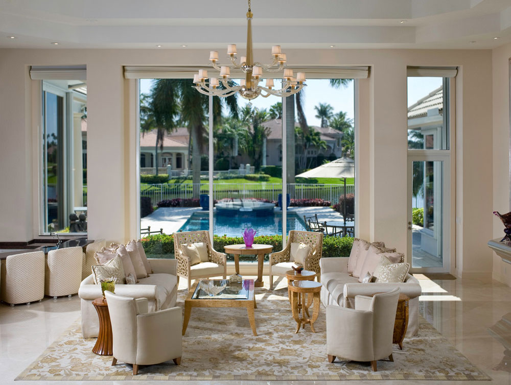 Image source: Fredman Design Group
The reason that most neutral interior schemes fail is that people are too lazy to plan them properly. You wouldn’t believe just how many people choose beige or cream because they don’t want to redecorate in a short lapse of time.
Consequently, they throw few pops of poorly combined pastels and think the job is done, but this approach is wrong in its very nature. It is up to you to think why you prefer neutral interiors, and up to us to tell you how to use colors for the purpose:
Styles which are compatible with neutral schemes
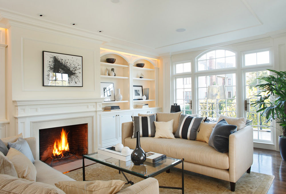 Image source: Winder Gibson Architects
The best thing about neutrals is their universality: you can apply them literally everywhere! The support every specific style, from the most traditional to the extremely modern ones. Neutral schemes make perfect backgrounds for any type of furniture or accessories, and blend in awesome combinations with all rooms and moods.
It is perfectly OK to use the same color in different shades
While this is not something we would recommend for light colors, it works out amazingly with cream, taupe, gray, or any other calm tone. The reason why you should apply these colors gradually is to add depth, and to make a statement.
The top notch among modern neutrals is gray, and the crazy affection for it is growing every day. Homeowners love gray because it has so many shades to experiment with, and you could also distinguish warm from cool tones to make stunning combination. Tone-on-tone decorating is very stylish eve in the case of other neutral colors.
Complex neutrals: the latest fashionable solution
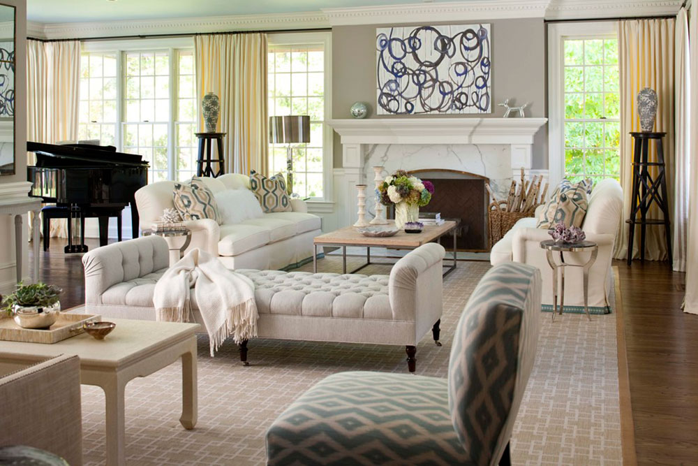 Image source: MuseInteriors
Designers moved far away from 90s’ favorite neutral solutions, but they didn’t forget them. They developed a brand new ideology that dissolves traditional barriers between different color families. That’s exactly how the so-called complex colors (or new neutrals) appeared.
These neutrals are considered to be complex because of the color-make up used to create new muted nuances and undertones of the standard colors.
It is in fact a tactic that reduces the vibrancy of any strong color (including blue, green, red, or even yellow) in order to transform it into a neutral tone. For instance, a slight touch of black and white, and a nice olive undertone finish could produce a perfect gray sage nuance that looks cooler than usual.
Complex colors make for the safest and most livable options that match every style or décor.
Textures are essential
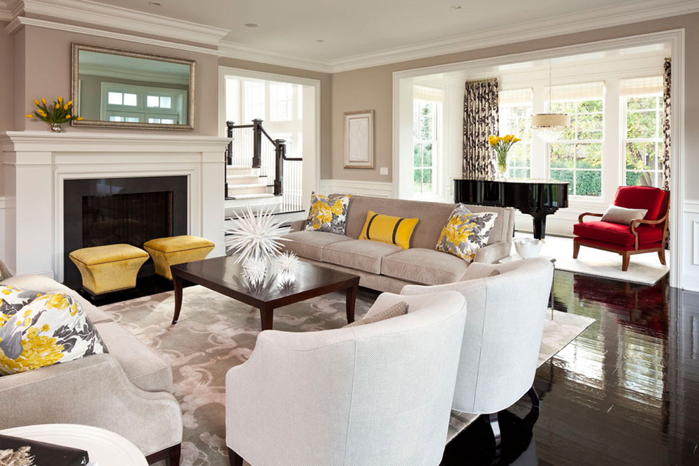 Image source: Martha O’Hara Interiors
In neutral interiors, textures play the same role as colors do in bold and challenging spaces. Textures make neutrals more eye-attractive, and they have an overall exiting effect on your living space.
There are many wonderful texture combinations to choose from. For instance, you can make your living room more exiting by applying leather, or natural fibers such as bamboo and wicker to make the appeal more soothing.
The elegant picture can be reinforced with cute throw pillows, comfy plush rugs, or a single Pashmina throw.
Neutrals in the service of warm interiors
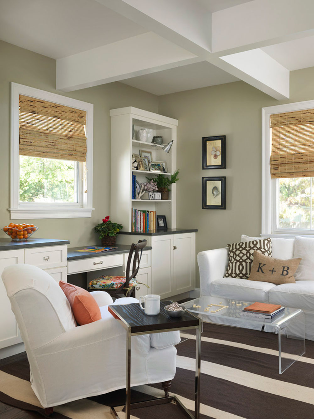 Image source: Kate Jackson Design
The only thing you should do to make your neutral palette warmer is to add few comforting, pastel orange tones. Neutral orange is the favorite choice for Asian inspired low furnishing because of the fact that it enhances the purity and smoothness of the room where it is applied.
It is mostly used because of its clean appearance and calming influence. For what we know, even stronger orange hues can be ‘calmed down’ with white trims and accents, especially if your purpose is to decorate bedrooms and similar serene spaces.
Undertones
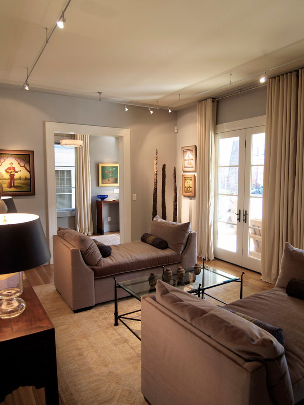 Image source: Joel Kelly Design
The theory that you can combine all neutral colors between each other is nothing but a deception. A much smarter solution is to go monochromatic, namely to use various undertones of a single neutral color. Undertones can be both warm and cool, and they look amazing together when you manage to balance them properly.
Glittering gold and shiny silvers
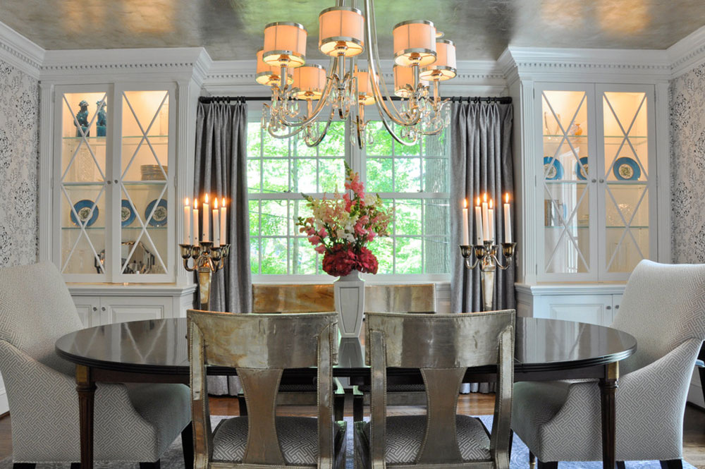 Image source: CM Glover
The popularity of applying shiny gold and silver is comparable to the one of bold color spurts; and the large presence of glowing metallic accents is there to prove it. Designers of our time draw inspiration from 60s/70s retro solutions, and they do their own contemporary reinterpretations with gorgeous cooper, golden and silver finishes.
Calm taupe
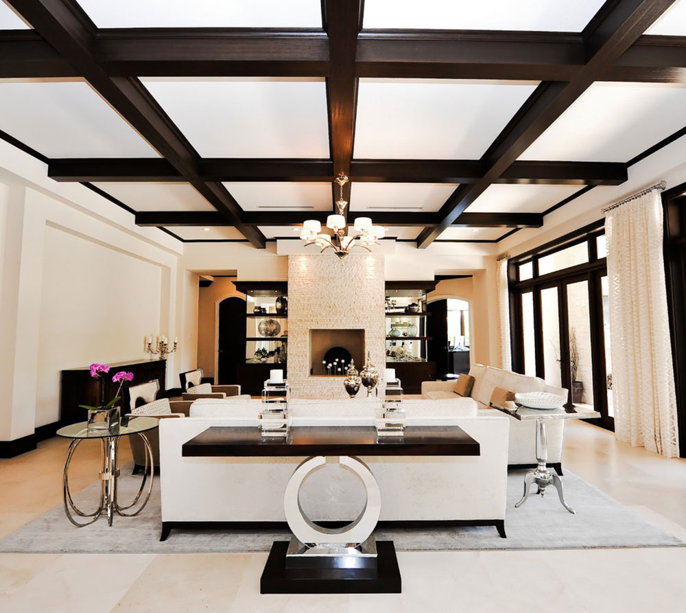 Image source: tuthill architecture
Taupe should come on top of your list for creating peaceful and harmonious rooms. Assuming you’ve applied it with the right textures and subtle color combinations (chocolate, olive, etc) it will help you create a genuine relaxing haven in no time.
Contrasts
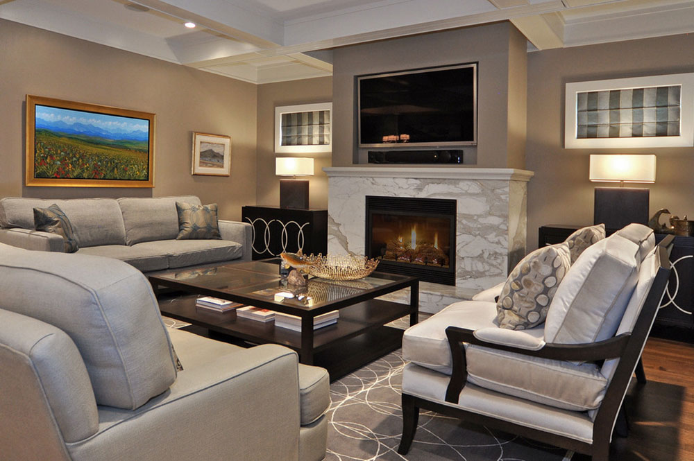 Image source: Bruce Johnson & Associates Interior Design
There are many contrasts to be considered in neutral environments-in fact; almost every contrast could work there! You can try cool verses warm, polished verses textured surfaces, shiny glass verses dark wood, or nubby burlap chairs verses steel furniture. You decide!
Combinations of neutral and bold colors
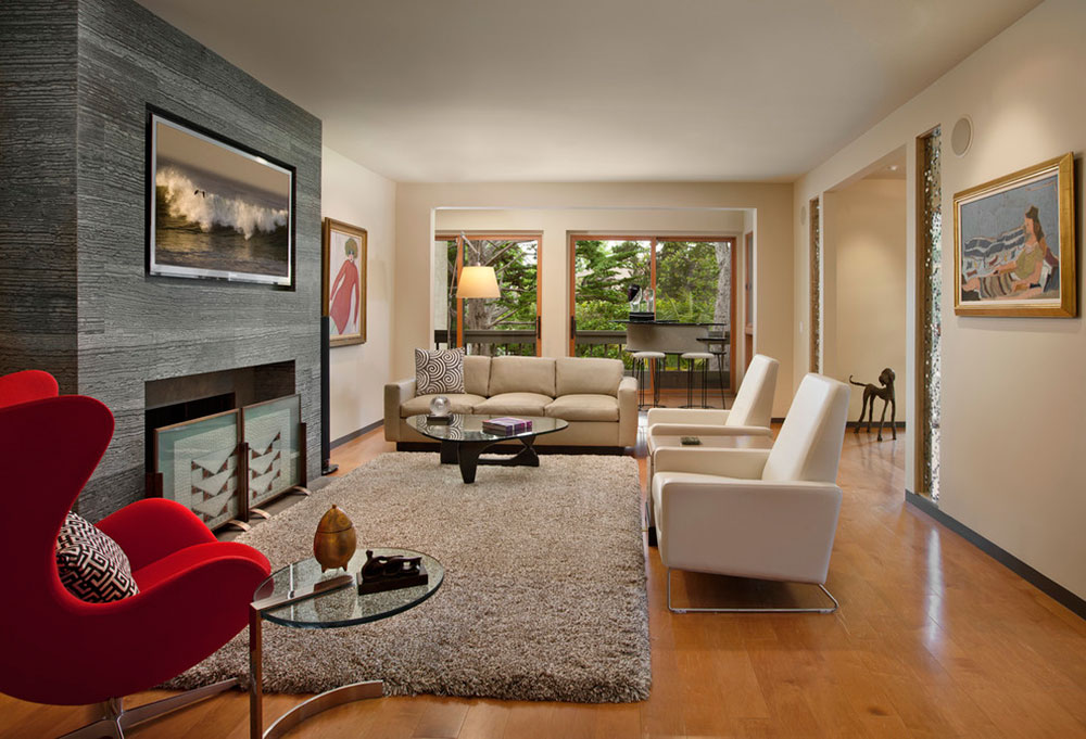 Image source: Allen Construction
Such combinations are perfect for homeowners who want a generally calm appeal, but are struggling to give up on their creative colorful ideas.
That’s when wonderful pop combinations come on the scene, spreading all the way from walls to furniture to make the place dynamic.
In most of the cases, neutral palettes are used to serve as a backdrop, while brighter and heavy-saturated ones apply to furniture fabrics or accessories in general.
In order to execute this scheme successfully, you should follow these guidelines: Use a maximum of three colors, because more could look overpowering, and you don’t want things to slip out of control.
The colors should match your favorite accessories, which makes those accessories the starting point of your design. If you follow these rules, there is absolutely no way to ‘misbalance’ the place.
Multiple geometric patterns
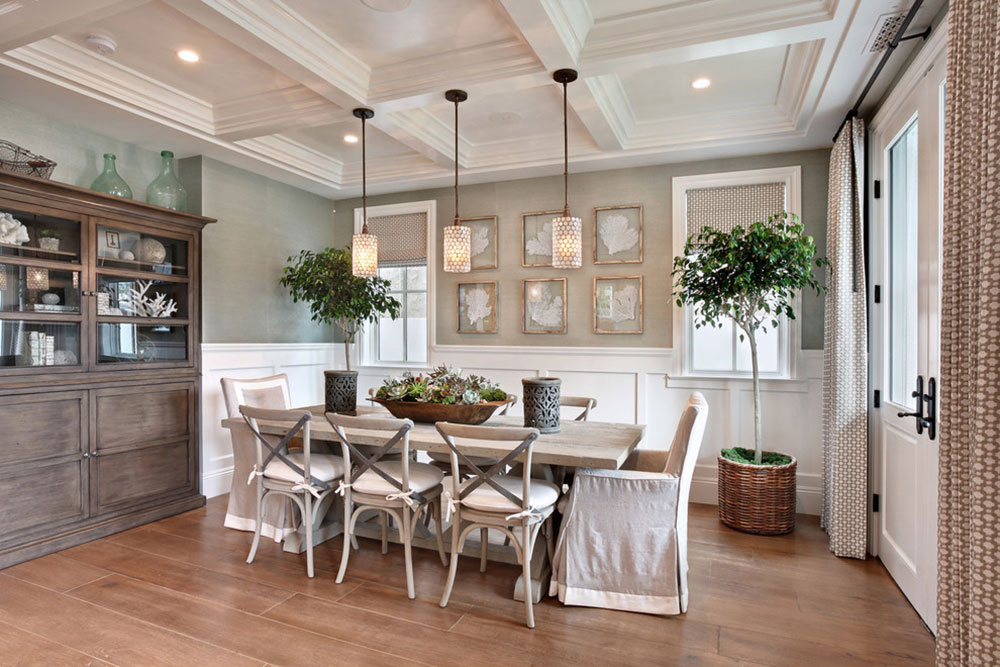 Image source: Brandon Architects, Inc.
If you think that gradation and texture are not enough to make your place vibrant, consider introducing multiple geometric patterns in different and contrasting shapes.
For instance, the dominant straight lines of your living and dining areas could really use an unusual curve ball placed in an interesting location.
Geometric patterns add excitement in every environment, and they give you more experimental material than colors and shades do. For instance, think about visually attractive and unique tables, odd rugs, DIY art on the walls, or extraordinary accessories.
A neutral exterior
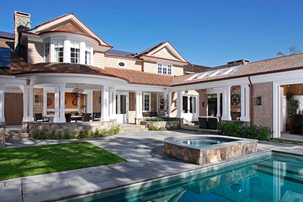 Image source: RDM General Contractors
As you saw for yourself, neutral interior schemes are a timeless and elegant choice for every home. This applies both for the interior and exterior, having in mind that you can use even more exceptional solutions outside the house.
To be completely frank, bright and intrusive houses will never look as good as transcend ones, and this stands for cases when they blend into the suburbs’ color scheme, or when they stand out because of your tastefully chosen cream tones.
A good source of inspiration could be Mediterranean homes-they look absolutely gorgeous when painted with rich neutral undertones such as pale yellow. Tasteful and timeless, neutral colors are a wonderful choice for the exterior of your home.