Imagine your space as a canvas—blank, inviting, and limitless. Now imagine grey: a hue often pegged as mundane, yet I see it as the silent maestro orchestrating a symphony of colors. It’s the unsung hero of design, a foundation that lets other colors sing.
In the tapestry of design, colors that go with grey stitch together a narrative of muted elegance, a harmony of hues that quietly whisper sophistication. The subtle power of grey, from the softness of dove to the depth of charcoal, frames life’s palette with an air of composed calm.
This piece unfolds the secrets entwined in the grey spectrum. You’ll journey through color schemes, unlock the psychology behind the shades, and emerge with a blueprint to infuse your space with colors that resonate. From contrasting metallics to warm earth tones, each paragraph paints a stroke of genius on your design canvas.
You’ll leave equipped, your vision clarified. Say farewell to guesswork; this is the dawn of intention in your design dialogue.
Colors that go with grey
| Color | Mood it Creates | Ideal Room | Complementary Textures | Design Style |
|---|---|---|---|---|
| White | Clean, Expansive | Living Room, Kitchen | Marble, Silk | Minimalist, Scandinavian |
| Black | Dramatic, Sophisticated | Office, Bedroom | Leather, Velvet | Contemporary, Industrial |
| Navy Blue | Calm, Confident | Bathroom, Bedroom | Linen, Wool | Nautical, Traditional |
| Mustard | Warm, Inviting | Dining Room, Kitchen | Tweed, Burlap | Rustic, Bohemian |
| Dusty Pink | Soft, Romantic | Nursery, Bedroom | Cotton, Faux Fur | Shabby Chic, Modern Romantic |
| Emerald Green | Lush, Luxurious | Living Room, Library | Velvet, Satin | Art Deco, Glam |
| Burnt Orange | Warm, Energetic | Playroom, Kitchen | Canvas, Suede | Mid-century Modern, Eclectic |
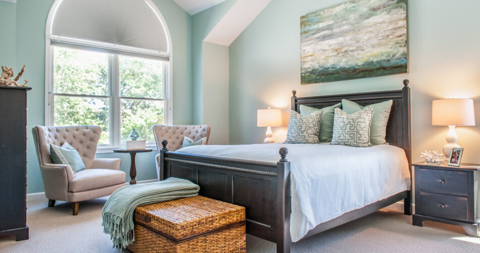
Grey and Pink
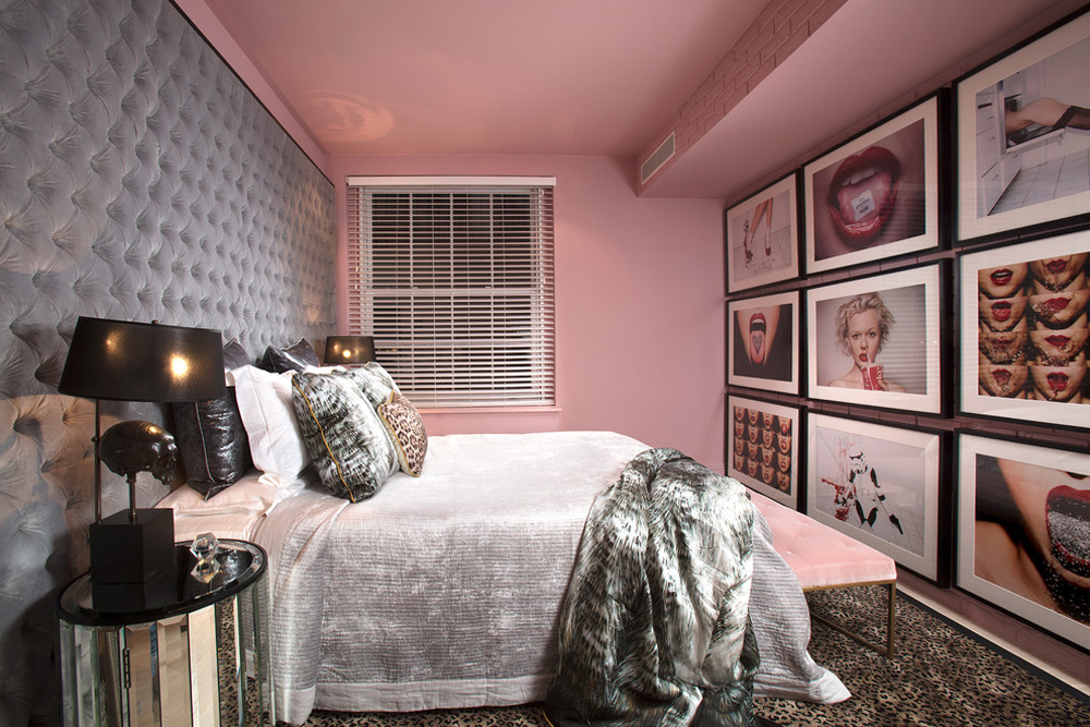 Image source: Elayne Barre Photography
Grey works very well with subtle shades of pink. In this photograph, you can see how the subtle pink bedspread works well with the geometric wall headboard and grey throws.
The key to capturing this look is to blend your color tones. The grey shades on the wall stand out while the bright white in the bedding and subtle pinks add an interesting touch. You can try several pink home decor elements to create this look.
Grey and Gold and White
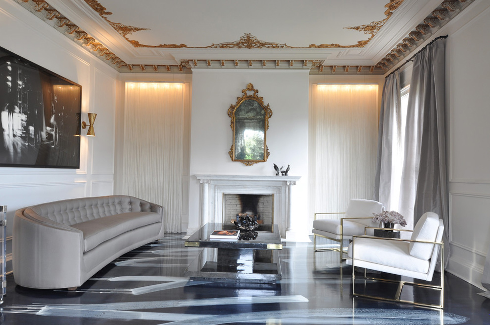 Image source: Janet Paik
Although grey was once seen to be a dull color, symbolic of moody days and air pollution, this image shows that the color grey can be used to create an atmosphere of sophistication.
Grey mixed with gold and white create a luxurious feel. You can also use an inviting texture, grey, white, and gold.
Grey and Navy
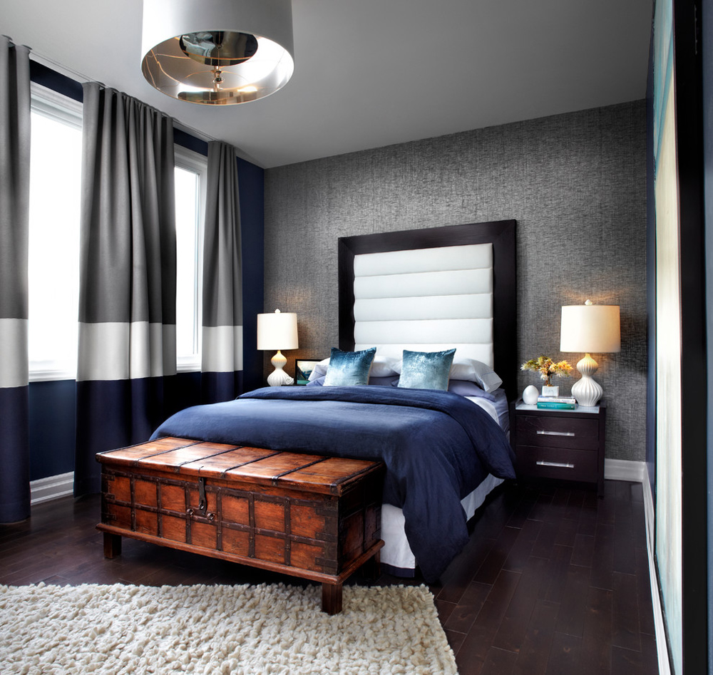 Image source: re:source lifestyles
Grey and navy are both timeless, neutral colors which will add sophistication to a room. The colors combine well to create a classic color scheme.
This color combination is particularly effective when a light grey is used. This prevents the color scheme from becoming too heavy when the navy blue is added.
Grey and Slate Blue
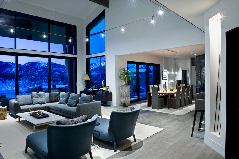 Image source: Sapp Development Group
Grey has become incredibly popular as a neutral color. However, if you wish to liven up your grey room, slate grey is an excellent option. Slate grey contains a variety of grey tones while the blues will add pops of color. The result is a sophisticated and urban feel.
Grey and Aqua
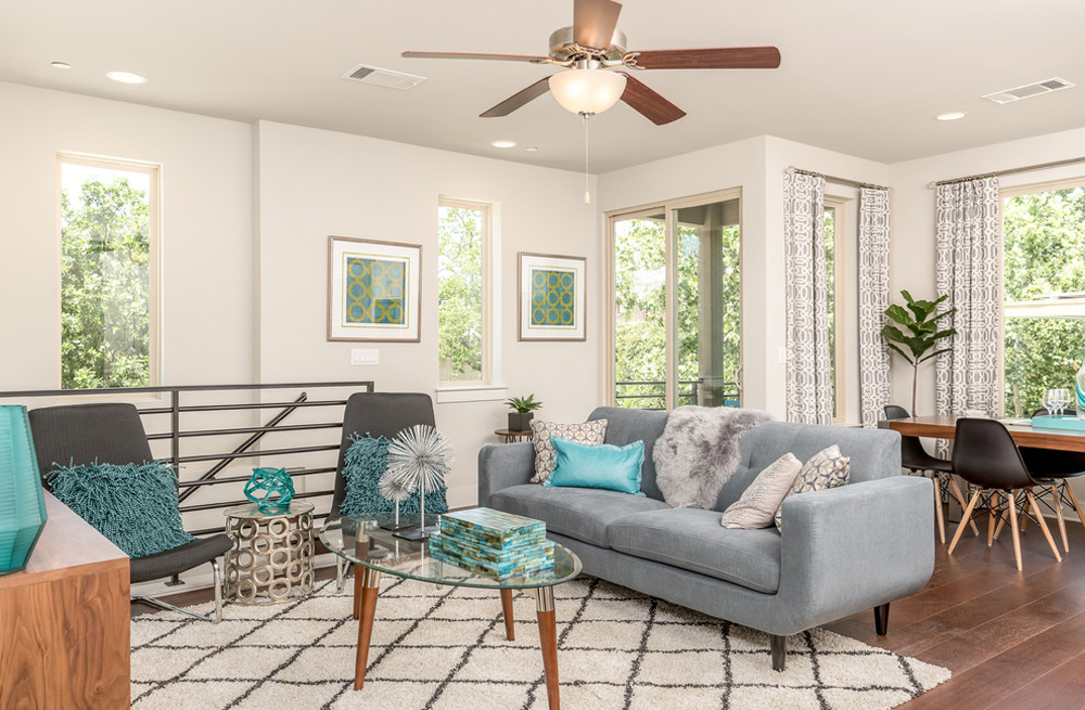 Image source: MileStone Community Builders
If you are using dark grey as decoration, you’ll be surprised how adding the color of Caribbean waters will bring your room alive. You can do so with some aqua pillows, or even aqua chairs.
The brightness of the blue will contrast with the neutral grey with remarkable effect. When you combine grey with a bright accent color, any details or textures will come to life. Be restrained when decorating to allow these details to stand out.
Grey and Driftwood and White
 Image source: Revision LLC
When using the color grey, it’s helpful to remember that light grey is more feminine, while dark grey has a masculine undertone.
If you’re hoping to create a beach house feel with a light, serene coastal feel, you could always combine a light grey background and faded driftwood shades with white.
These colors will give an overall muted, relaxed feel while remaining distinct. The result will be a relaxed, muted home with added interest.
Grey and Red and White
 Image source: Blue Ocean Design
Red is a vibrant color, and when paired with white they create a dramatic impact. When you add grey, the result is softer and more balanced.
You can add a light grey color in the background. However, a dark grey color such as charcoal will have more of an impact. This is an excellent color pallet for introducing different shades of grey. This will give an impact without clutter.
What you can use to decorate a room in this palette:
Grey and Red
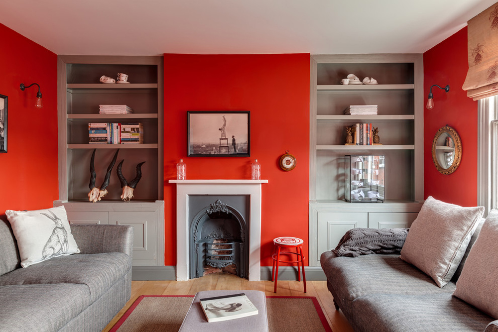 Image source: Arq-A Interiors Limited
If you are looking to create a Zen style home or a peaceful room, soft grey walls create a serene effect. You can contrast this serene effect using red decorative elements. Or vice-versa. Bright red will add a vibrant feel to a room or home, whereas a deep brick or burgundy will create a sophisticated feel.
What you can use to decorate a room in this palette:
Grey and Taupe
 Image source: Friedman & Shields
Taupe is one of the most effective colors that go with grey. This is because grey and taupe are so closely related. Taupe is a mixture of brown and grey.
While grey paint colors add structure and serenity to a room, taupe adds warmth. Adding luxurious textures such as satin or velvet, or highlighting interesting architecture will create a stunning effect.
When you combine pale grey, taupe, and white, you will end up with a serene color palette which has both stability and flow.
This monochromatic effect is great in bedrooms. Remember that your accents or textures can be used to add luxury, so go for interesting lines as well as velvety fabrics that you long to touch.
What you can use to decorate a room in this palette:
Seafoam
 Image source: Allison Ducharme Interior Design
Seafoam is a lovely, soft mix of green and blue which adds interest to a grey interior. By adding seafoam accents to your home, you’ll create an interesting, contemporary, and very modern space that feels welcoming.
Marshmallow
 Image source: Gary Hutton Design
Soft greys combined with fluffy marshmallow whites will create a relaxing space that you’ll long to come home to. This color combination is an excellent choice when you want to wind down, making it a great palette for a bedroom or living room.
Grass
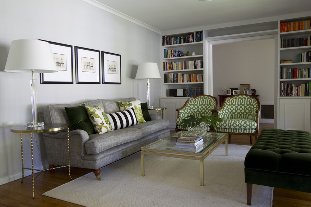 Image source: Camilla Molders Design
Draw on colors found in nature and add fresh or vibrant greens to compliment grey walls. The freshness will combine to bring you a space that feels full of life.
Midnight
If you’re interested in creating a sophisticated yet masculine vibe, add black to your dark grey walls. The result will add depth as well as classic sophistication and is very easy to achieve.
Sun
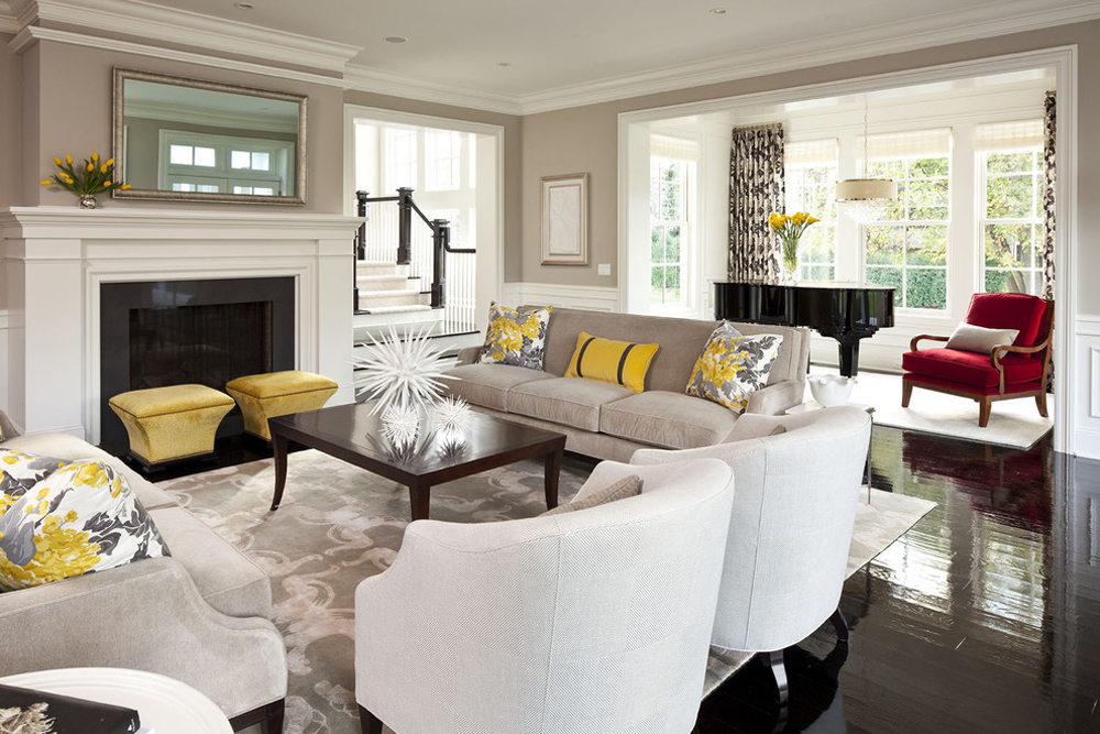 Image source: Martha O’Hara Interiors
If you’re looking to create a sunny spot, combine greys and warm yellows. The look is trendy and hipster styled, but warm and lively. You could use these color combinations anywhere in your home.
What you can use to decorate a room in this palette:
Rose
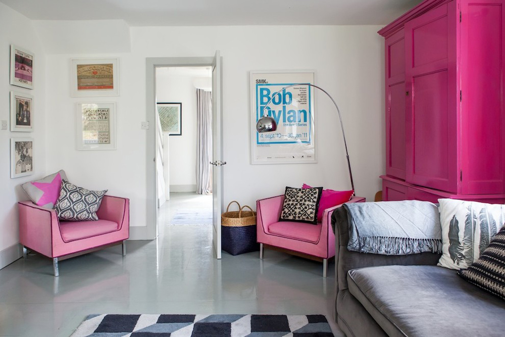 Image source: Gabriel Holland Interior Design
If you’re creating a feminine home, rose pink is a great choice to combine with a light grey background. The result is fun and pretty, with a touch of sophistication.
Cherry
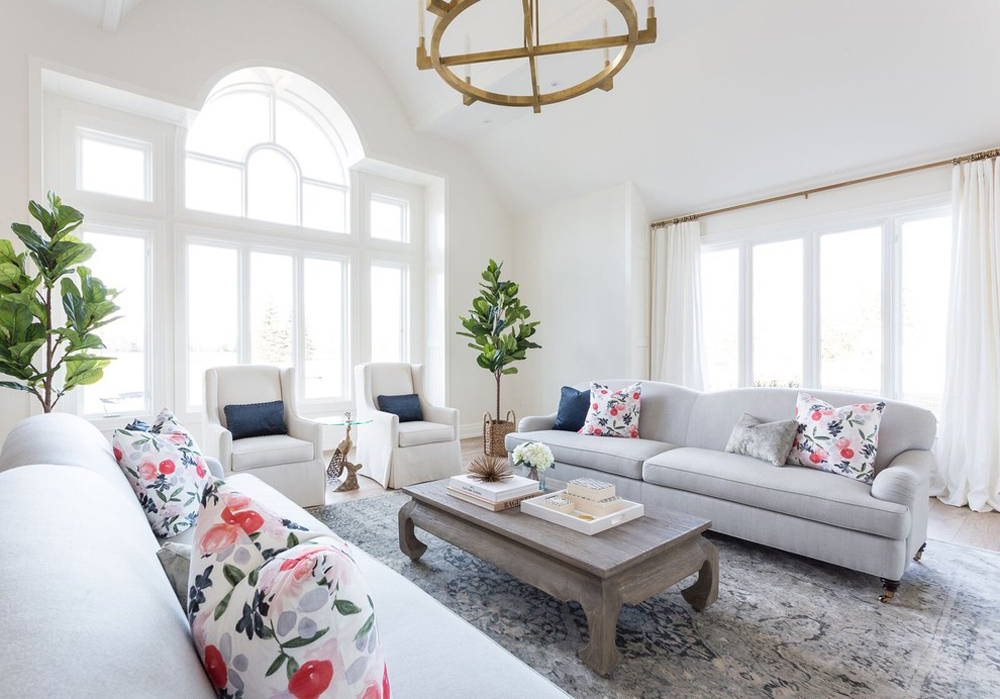 Image source: Coco & Jack
Cherry is bold and cheerful and can be combined with light grey paint colored walls to create a vibrant space. The deep cherry will contrast with your grey paint to produce a stunning effect.
Violet
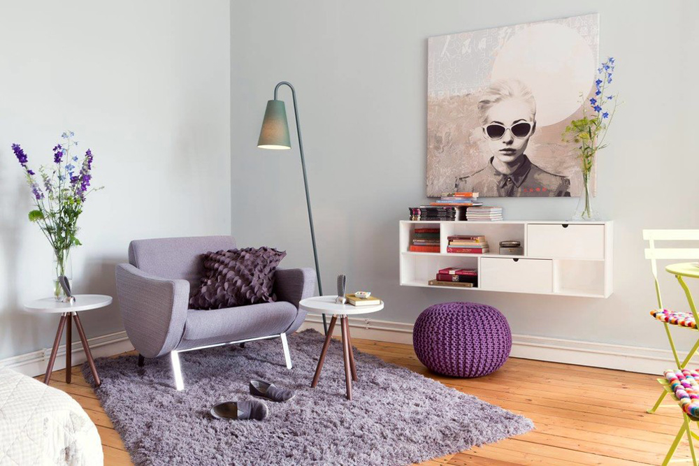 Image source: Co.Laborateure – Die Wohnbildner
If you’re looking to create a sensual home, add violet accessories to enhance your grey walls. You can even add deep purple accents to add a unique, creative, and regal feel to your rooms.
What you can use to decorate a room in this palette:
Coral
 Image source: Sam Allen Interiors
If you want to add a fun touch to your home, add coral accent colors to warm grey walls. Coral is often seen as feminine but it is also lively and fun. Add coral touches to your living room, kitchen, or dining area for a vibrant touch.
What you can use to decorate a room in this palette:
Grey & white
 Image source: Lisman Studio Interior Design
White looks clean and crisp against a grey wall. When contrasted with mid-tone grey, white looks fresh and sophisticated. Add blonde wood and the results will be stunning.
This image shows a cohesive look, with the subtle stripes in the blind followed through in the table wear and runner. To create a balanced look, the grey wall is of a matching shade.
How to find the right shade of grey
Grey has become a trend over the past couple of years. This is because it is both versatile and sophisticated. With grey becoming a staple in our homes, it can be hard to know which color to select.
From a blue-grey color to grey-brown, there is a range of grey color schemes. The choice you make for your home will suit your own tastes and requirements. Have a look at what you need for your own space and allow this to guide your choices.
Best for brightening up spaces with low light
If your home does not have a lot of natural light, you don’t have to stick to white shades. Warm grey colors or greys with a touch of yellow, gold, brown, or pink (such as Modernism) will give you a warm-toned room that feels light and airy.
Best for natural materials
Natural materials look great with grey paint, and particularly when you have white trim around the edges to keep it fresh looking.
If you have natural woods such as oak, plywood, or stone finishes such as limestone, try to use light grey walls to bring out the natural grain or color in the stone. Your home will shine this way. Silverwood is a great grey paint option to try.
Best paints for adding ambiance
When choosing your paint color, your goal will be to add atmosphere to your home. If you are looking to create a peaceful but luxurious space, dark charcoal greys will add ambiance.
Pure Shadow is an excellent paint choice for moody walls. Combine this great shade with textures such as wool, felt, or corduroy. This paint color goes very well with dark flooring and deeply textured rugs.
Best for bright accent colors
 Image source: Beth Dotolo, ASID, RID, NCIDQ
If you want to add bright accent colors, you’ll be looking for a versatile grey paint color that goes well with a range of hues. A light grey paint such as Dapple Grey makes a great choice.
Your accent colors will stand out against this great hue. So whether you choose punchy colors like yellow or the fresh color of green grass, use a fresh, serene grey as your backdrop. Your accents will stand out.
FAQs about colors that go with grey
What Accent Colors Work Best with Grey?
Grey’s versatility is unmatched. Imagine it as a neutral backdrop, ready to be splashed with vibrant reds for energy, or blues for a tranquil vibe. Pink whispers sweetly against grey, and gold brings a luxe touch, transforming the space with a swish of elegance.
Can I Pair Different Shades of Grey Together?
Absolutely, you can! Different shades of grey create a rich, layered look, echoing a sleek, contemporary feel. Light grey walls with dark grey furniture? A classic. The key? Balance the tones for a seamless blend, ensuring your grey story has depth and interest.
Is Grey Too Cold for a Cozy Look?
Not a chance. While grey can be cool, wrap it up with rich textures and soft fabrics. Think woolen throws, plush cushions. Add a dash of creamy whites or deep yellows, and you’ve got a hug of warmth in any room.
What’s the Best Way to Introduce Color into a Grey Room?
Start small. A bold, colorful art piece, vibrant cushions, or a brag-worthy rug works wonders. These hints of color against the grey scale create a visual interest that’s both chic and inviting. It’s about that pop!
How Does Lighting Affect Grey and Its Complementary Colors?
It’s a game-changer. Natural light can make light greys glow, while painting them with serenity at dusk. Artificial lighting? It sets the stage, highlighting the colors you’ve woven in, making them dance or mellow as you decide.
Does Grey Work Well with Wood Tones?
A resounding yes! Grey and wood are like old friends; they just gel. Grey tones down the rustic, while wood injects warmth into the cool. It’s a timeless combo that oozes organic elegance.
How Do I Make Grey Look More Modern?
Straight lines, minimalism, and bold accents. Silver accents, streamlined furniture, and abstract art propel grey into the realm of ultra-modern. It’s the canvas for your contemporary masterpiece, the space where simplicity meets sophistication.
What Color Curtains Go with Grey Walls?
This calls for a touch of personal flair. Sheer whites for a breezy feel, navy blues for bold contrast, or even patterns with a spot of grey. Curtains are your stage curtains; they can shift the entire mood of the room.
Can Grey Be Used in Any Room?
Kitchen to the bedroom, bathroom to the living room, grey scales up or down to suit your space. It’s the chameleon of colors, capable of echoing your space’s purpose with the right accents and textures.
Is Grey Still in Style for Home Decor?
Grey is timeless. It pivots with trends, morphing from industrial chic to Scandi cool. It’s a solid base that evolves with your taste and the times. Trust me, grey isn’t going anywhere—it’s a stalwart in the color world.
Conclusion
Wrapping this up, colors that go with grey, think of it as this orchestra, right? Grey is your conductor, setting the tempo. It harmonizes with pastel pinks for soft whispers in a nursery, or pairs with bold emerald greens, echoing the depth of an old library.
- It’s about the mood you want to set.
- It’s about those personal touches that say ‘this is my space.’
So, here’s what stays with you: Grey isn’t just grey. It can be cool, composed, or downright playful. It carves out space for creativity, lets you tell your story.
Think metallics for glamour; they’re like jewelry for your room. Or, turn to earth tones for grounding, a nod to nature. You walk away now, palette in hand, ready to brush those greys with hues that speak in volumes the story of you. That’s your power, your narrative. Go on, paint it bold.