Advertisement
The color taupe has taken over the design world. It is so popular that it even feels strange not to think that it was once less dominant.
Color is likely one of the most important aspects when it comes to designing a home.
You need the right colors to symbolize what you want or to add atmosphere and harmony to your home. When color is done well, you will have an aesthetic appearance rather than a feeling of chaos or disharmony. Designers are currently working with a taupe color chart in order to create warm, sensual homes.
Colors are important and can have a lot of value and meaning to them. For this reason, you want to make sure that you get your colors right as you design a room or the overall theme of your home.
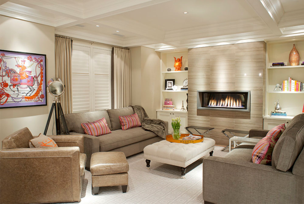
Image source: Tvizz
Colors that go with taupe walls and furniture
There are certain colors that are incredibly popular, particularly in interior design. Shades of blues, reds, grays, whites, and black all fall into this category. These colors are very common and are easy to describe to your interior designer or the person or company you are ordering installations from.
You can easily order a bright red refrigerator or a dark brown bookcase or a lime green lamp. Brown shades are popular in interior design because they create a rich, earthy and homely feel.
Image source: Contemporary Bedroom
Then there are the colors that are not so easy to describe, and thus, these colors are not used as often as the others. Colors in this underrepresented category include glaucous, sarcosine, verditer, and labrador, as well as many others. There is also another color that fits well in this group: the taupe color. “What color is taupe?” you might be asking.
Image source: Echelon Custom Homes
What Color is Taupe?
Taupe, which is also known as “greige”, is a color that you need to see for yourself in order to truly understand it. For those who are unfamiliar with the color and don’t know what this color looks like? , you may be wondering, “what does the color taupe look like?” Taupe is an odd mix of colors. It is not quite brown but also not exactly gray. It is a greyish brown.
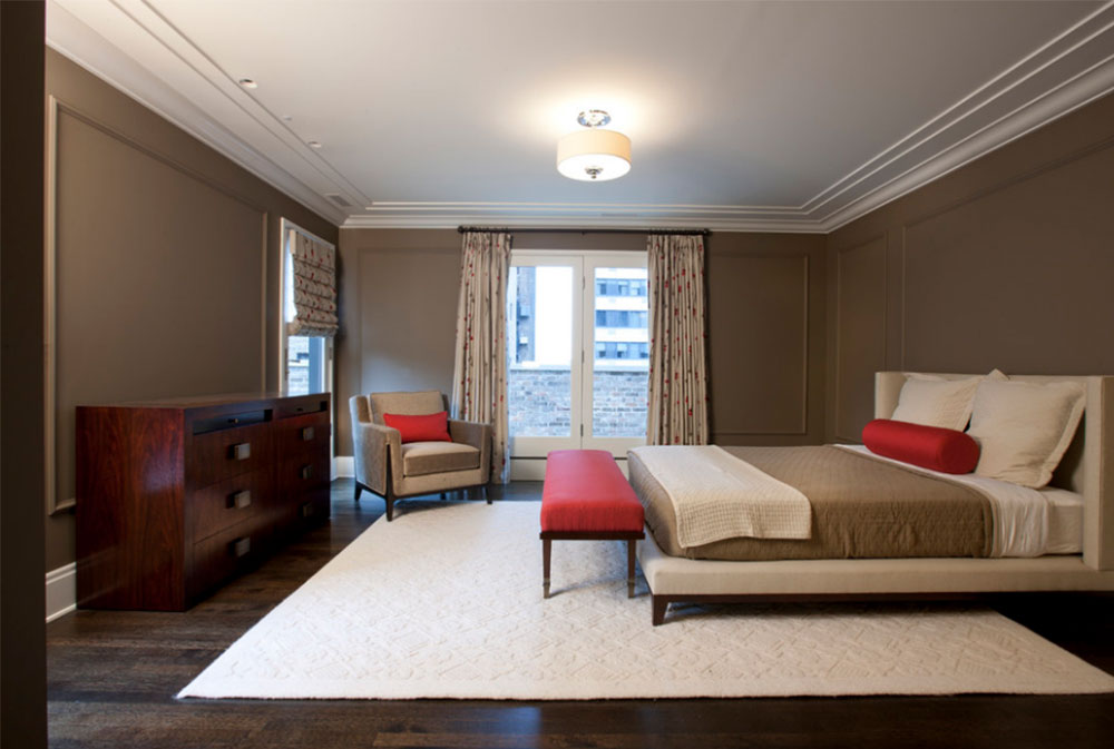
Image source: Michael Abrams Limited
It fits somewhere in between these two colors, creating a sort of brownish gray. Overall, the color is usually more gray than brown, so if it had to go into one family of color, it would better fit in with the gray family. While taupe is not very popular, it is a great color for interior design. Taupe paint adds an instant atmosphere to a room while dark taupe is an excellent accent color.
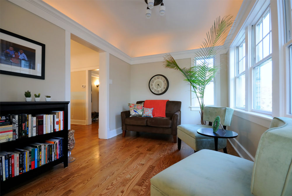
Image source: Brooke Marks
What Does the Color Taupe Represent?
To answer this question effectively, you first need to know what the color gray represents, since taupe is along its spectrum and shares many of its characteristics.
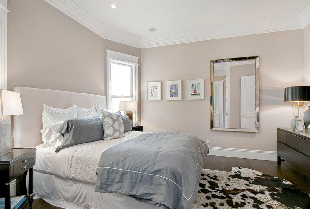
Image source: Cardea Building Co.
The color gray is a mix of the colors black and white, the color takes the best attributes from both black and white while adding some of its own. Like both colors, gray is rather neutral and well balanced. It is a calming color in that it is not a bright as white but not a dark as black. It does not stimulate nor excite.
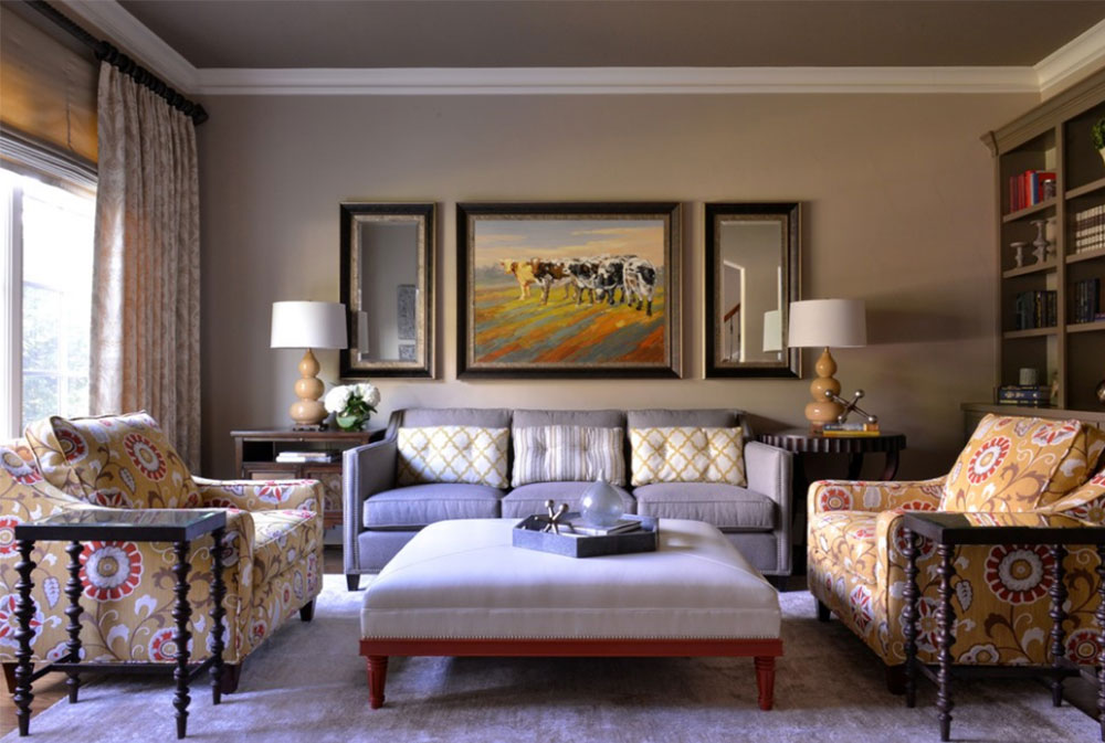
Image source: Barbara Gilbert Interiors
It is a truly timeless and practical color. Personality-wise, gray can symbolize sophistication, practicality, intelligence, passivity, reliability, elegance, modesty, dignity, and maturity. Taupe contains all the very best qualities of grey.

Image source: Lucy Call
However, no color is without its negative traits. Gray can be viewed as boring by some. It is a conservative color, lacking in energy. It can be seen as depressing or even lonely. Gray can be seen as emotionless or even moody. It is sometimes used to depict impurity or dinginess. Most people are indifferent to the color, so if you want to show off, gray rooms are not the way to go.
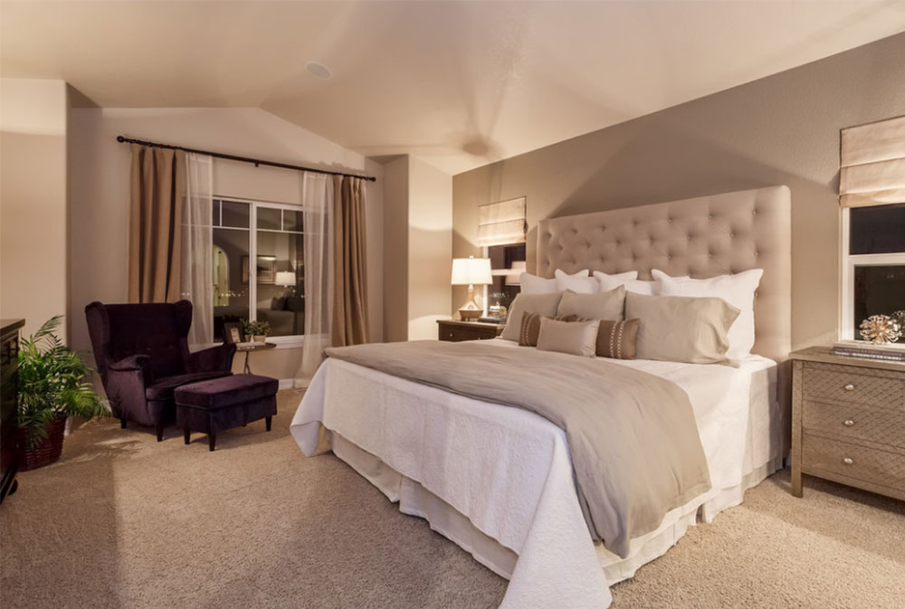
Image source: Housing & Building Association of Colorado Springs
As with any color, different shades can have varying effects. Light grays are calming and enlightening. They have a softer, less intense feel. A dark gray room is one that is more conventional, serious, and possibly solemn.
Add the brownish grey of taupe and your room will instantly gain warmth and appeal. Like grey, there are shades of taupe. But taupe walls will add a touch of warmth to the serious sophistication of grey.
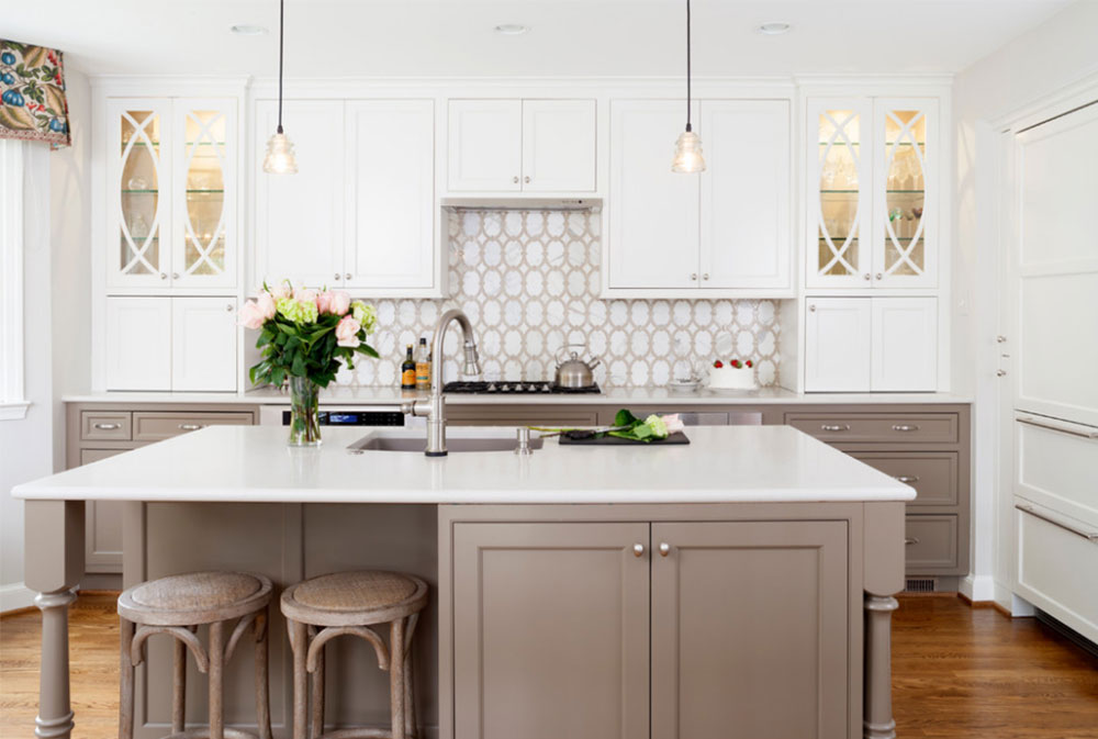
Image source: Case Design/Remodeling, Inc.
Grey can symbolize self-denial as well as self-discipline, as emphasized by the strictness of the color. Taupe is more gentle, as a mixture of both grey and brown. As a result, it gives a warm appearance to a room.
There are many different tints and shades of taupe, as well, so it can be combined with either dark gray or light gray to its advantage. As a mixture of both grey and brown, there are a number of variations. As a result, a taupe color wheel is used for precise color selection.
Image source: Blue Sky Building Company
Since taupe shares attribute with gray, it is a very neutral color, making it great for backgrounds or for subtly accenting a room. It represents sophistication, conservation, warmth, and calmness. Because there is also brown inside of taupe, making it a brownish grey color, we need to know what aspects of brown are in the taupe color.
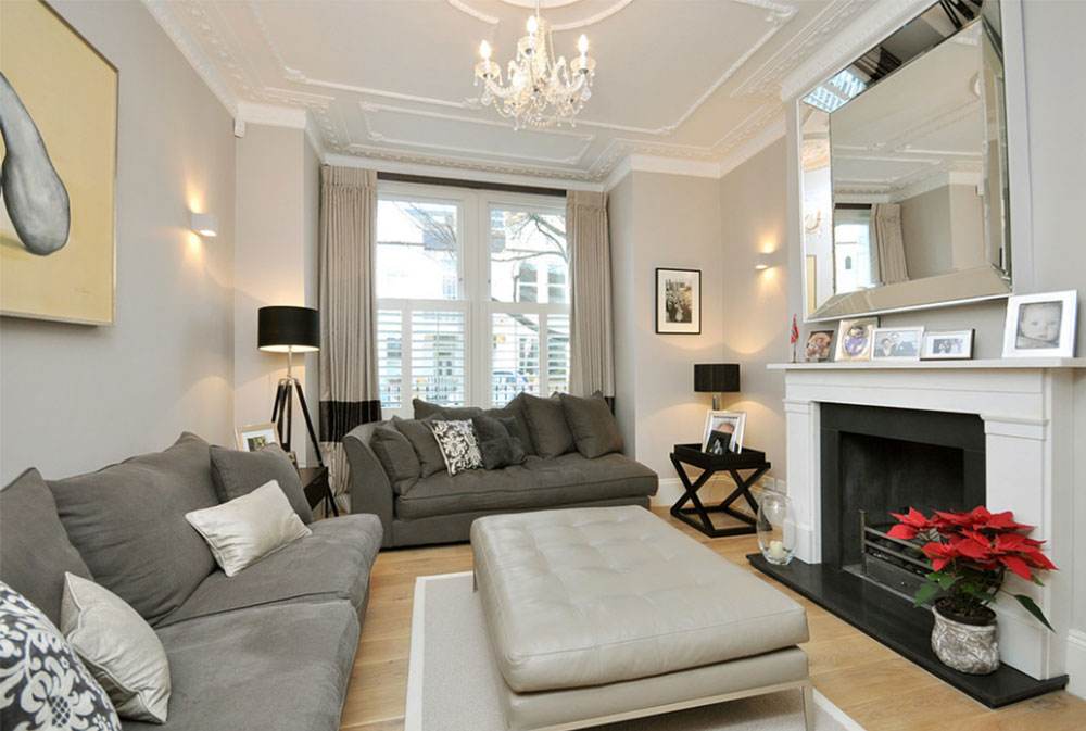
Image source: MDSX Contractors
Brown, like gray, is a serious color. It offers a sense of protection and security. It is strong, yet comforting in its simplicity, maturity, and reliability. A brown color is full and honest and it emphasizes moderation. It is elegant and classy, releasing stress with its stable nature. But brown, like gray, can sometimes have a reputation of being dull or predictable.
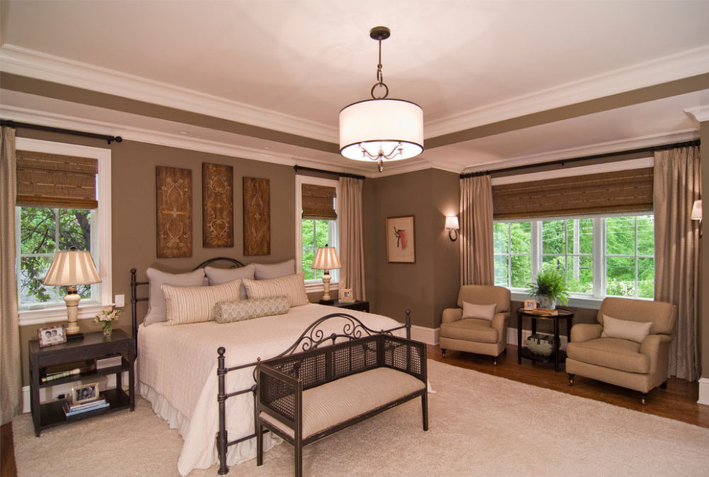
Image source: Carolina Design Associates, LLC
There is not, however, only a single shade of brown. Instead, the different types of brown create different moods. Light brown is warm, friendly, and welcoming. Beige is trustworthy and loyal. Ivory (which also falls on the gray spectrum) is sophisticated and simple.
Tan is a timeless and uncomplicated color that can symbolize nature. Dark brown is reliable, but can also have the negative effects of being depressing and materialistic.
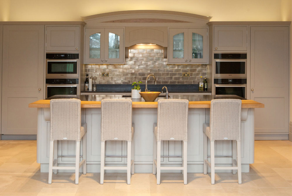
Image source: Anthony Edwards Kitchen
The true meaning of the color taupe depends on the shades of brown and gray that go into it. Darker shades of taupe are going to be more reliable and sophisticated, but they will also be at risk of seeming depressive or uninteresting. Lighter tints and shades are more welcoming and friendly.
How Do You Incorporate Taupe into Your Home?
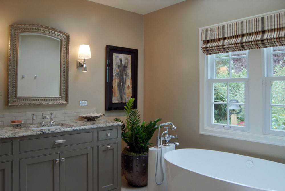
Image source: Jason Ball Interiors, LLC
Here’s the big question. There are many ways to include taupe in the design of your home. Taupe paint adds elegance and warmth to any room it is applied to. It captures light with ease and grace in ways that shades of white cannot accomplish. Natural light also emphasizes the delicacy of taupe, so it is a great idea to have a taupe living room where several or large windows highlight this unique effect.
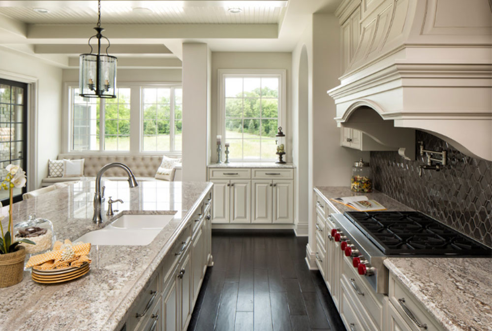
Image source: Custom One Homes
Taupe walls are also great because a taupe color is neutral, providing the perfect backdrop or simply avoiding over-stimulation as would be a problem with yellow or pink walls. With taupe as a background, place more colorful objects in the foreground, or use a colorful pattern on the walls to create a nice contrast.
But remember that there are different shades and tints of taupe, so you need to carefully choose which one(s) to use in your home for your maximum satisfaction. Rose-taupe, for example, would give a hint of warmth and afternoon light to a cool room, where cool taupes would have a calming, intellectual impact.
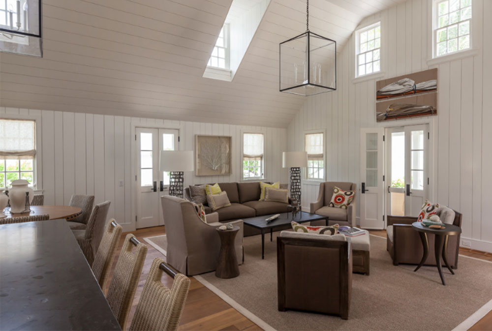
Image source: Laura Hay Decor & Design Inc
Just keep in mind that tints are lighter variations of the color while shades are the darker variations of taupe. Tints have more pure white added to them, with the lightest tints having the most white and the darkest tints having the least amount of white. You may want to research what the color white can represent if you are thinking about using some of the lighter taupe colors in your home.
Image source: Neil Mac Photo
If you want an elegant, modernized look for your home, here is an idea to try. Use a shade of grey taupe and combine it with a lot of metallic items. These would occur naturally in a kitchen or in a games room. This creates an industrialized atmosphere. Or for something cozier, choose only a few metallic objects, such as a lamp or a vase to add to a taupe color scheme.
Image source: Rachel Reider Interiors
What Undertones to Use
Taupe is a neutral color that is already very calming. However, too much of the color on its own can be boring and dull. To keep your home interesting or add vibrancy, consider adding some colorful undertones.
Image source: RW Anderson Homes
It can be hard to know what colors go with taupe wall paint to create an effective and valued undertone. Based on the description and picture of the color alone, you may think that it would be very difficult to find the right undertone. But contrary to what you may think, there are actually several colors that go with taupe quite nicely.
Pink or Red
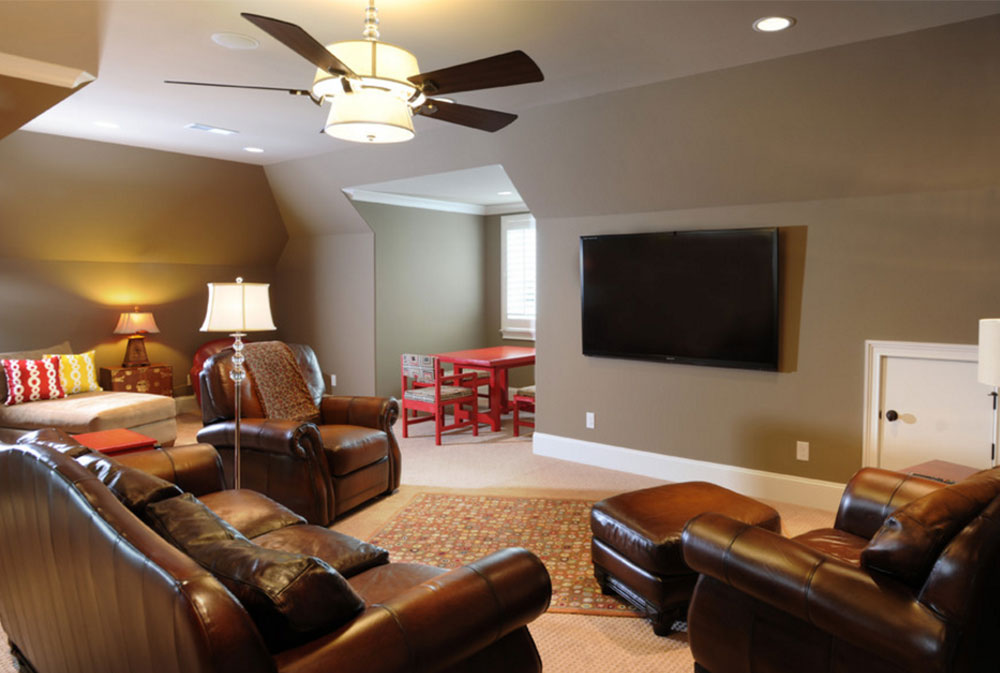
Image source: Brian Benda
Pink and gray is not an uncommon combination. It is often used in clothing. Red and gray, however, are a bit less common. Whether you favor pink or red, either color can be paired with your taupe living room walls to create a lovely and welcoming atmosphere.
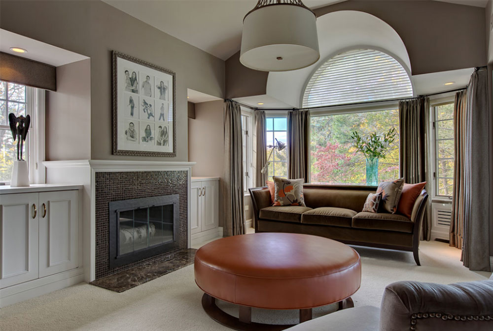
Image source: B Fein Interiors LLC
Pink and taupe create a sweet blend that is perfect for little girls with a strong, demanding personality. Pink walls with taupe accessories and a taupe cradle is a great idea for a baby girl’s nursery!
This combination can also speak to the taste buds, giving you a light craving for something sweet. You can also explore interesting bedding color combinations in an older girls’ room in order to create a sophisticated yet attractive bedroom.
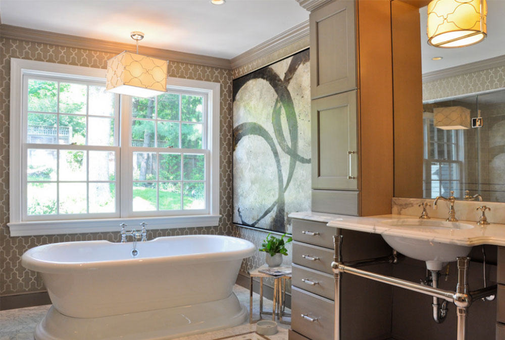
Image source: CM Glover
Pink is often used for icing and the taupe color can make one think of chocolate if the tone of taupe is more along the brown spectrum than the gray one. Use this color scheme for the kitchen if you like to bake a lot. A taupe brown color combined with pink will make a room cute and cozy.
Image source: Franck Minieri
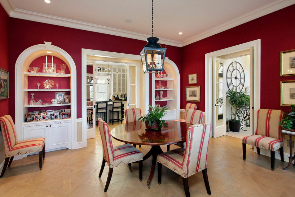
Taupe used with red can be a sophisticated combination. Red is a vibrant and bold color. It can be powerful and aggressive or sly and seductive. Red loves attention, and it is the first thing to attract our eyes when we walk into someone’s house. It is vibrant, passionate, greedy, and deviant. Combine this dominating color with the calm, neutral taupe and you have a powerful contrast. Taupe color walls with red furniture make for a balanced living room.
Green
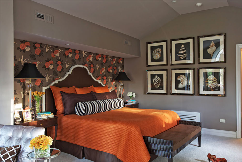
Image source: B Fein Interiors LLC
It does not sound like the most appealing color scheme, but you would be surprised at how well taupe and green can go with one another. This makes sense as the taupe color of pale tree trunks combines with green leaves in nature. It makes sense that adding a touch of green to taupe color palettes would have a striking impact.
When you combine the right tones of each color, you have the potential to make a truly graceful, delicate, and chic design. Here is a fabulous idea for how to create a taupe living room with the color green.
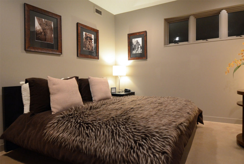
Image source: Turner Design Firm
Paint the walls a light lime green color. Have a lot of natural sunlight enter this room to beautifully reflect off the walls and other aspects of the room.
Use a light taupe color for the flooring or for a large rug placed on the floor. Include a dark taupe coffee table in the center of the room.
Add some artwork of nature and perhaps some potted plants to create a natural and calming ambiance. This room will also work great as a place to go when you need to relax and reduce stress.
That’s about it when it comes to colors that go with taupe.
Cool Taupe or Warm Taupe?
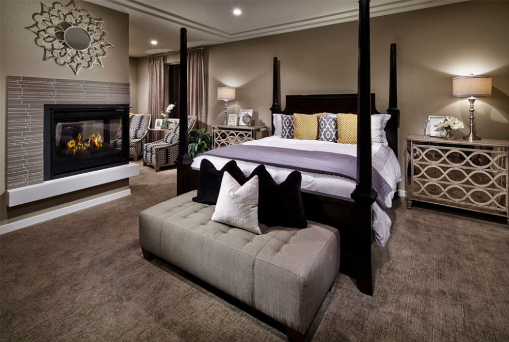
Image source: William Lyon Homes Colorado
When trying to match colors with taupe, you need to consider more than just the color you are adding. You also need to think about what shades or tints of taupe you will use to maximize certain effects.
Cool variants of taupe allow for a soothing atmosphere. Because of this effect, cool variants work great for bedrooms, bathrooms, and any room you go to for relaxation. Warm variants of this unique color are inviting and comforting. These shades are great for children’s bedrooms and living rooms.
Image source: Turner Design Firm
However, the best way to know what temperature of taupe to use is to consider what else will be in the room. Think about the furniture, paintings, and other accessories. Take into consideration that different colors, patterns, and textures that will be present in the room and adjust the taupe color accordingly to create a perfect match.
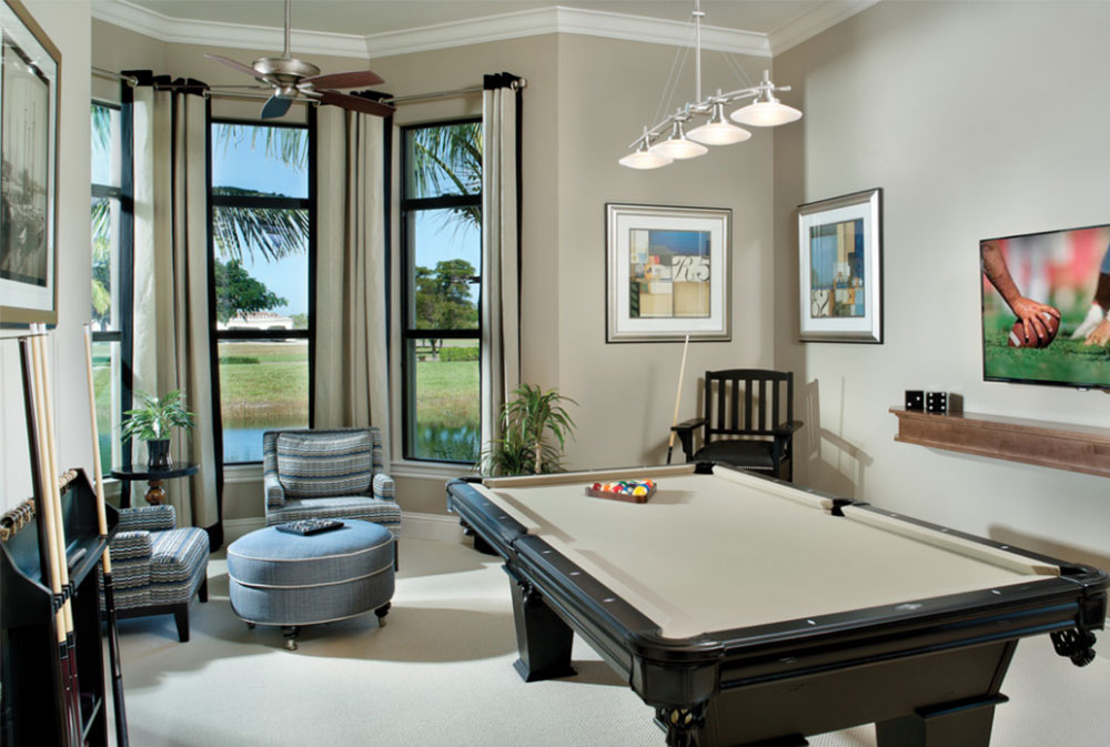
Image source: Arthur Rutenberg Homes
If you want subtlety throughout your home or the room, follow this advice: Undertone the taupe color of walls or flooring with the color that is used for furniture, or vice versa. This creates a consistent theme throughout but without calling attention to it.
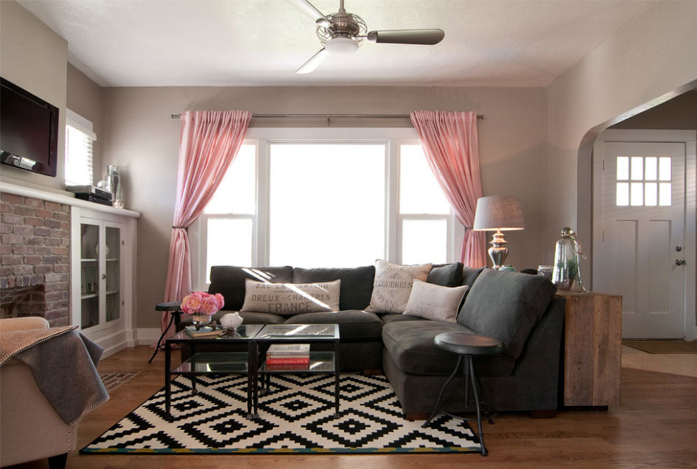
Image source: Lucy Call
However, if you are a bold person and want to show that in your home, the subtle approach is not for you. Accent taupe walls and flooring with the color that is the opposite of the color used for your furniture (or vice versa, of course).
This creates a striking contrast and shows that you are not afraid to step away from the conventional rules to try something new and more fitting with who you are.
Graying a Color
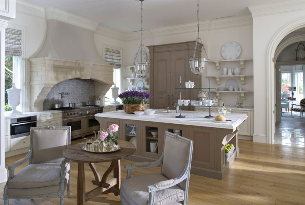
Image source: YAWN Design Studio
In interior design and other forms of art, there is a technique known as “graying a color”. This technique is a great way to make use of contrasts. To accomplish this, simply take a color and add bits of the color that is opposite to it. The strong contrast of these colors causes your brain to dull the main color in order to compensate for the difference.
When you have a green Christmas tree and add red ornaments, you are graying the green. When you have a bowl of tomato soup and add some green herbs on tops of it, you are graying the red. For blue, you use the color orange to create the graying effect, and use blue to gray orange. Bits of yellow, grays, purple, or violet and vice versa.
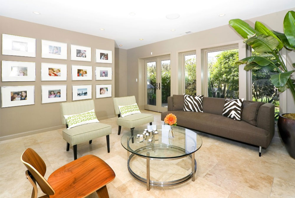
Image source: Amoroso Design
Sometimes, paints in one of the primary colors will have a bit of black added to them to also achieve this graying effect. Graying a color can be useful when designing a home if you do not want one color to stand out too much or if you want to create a contrast that is not too sharp.
What Depth to Use for Taupe
As equally important as figuring out which temperature of taupe to use for your home is knowing what depth to use. Depth is how light or dark a particular color is. Taupe has a broad range, going from very light tints to rather dark shades. Because of this great variety, there are many options to choose from, which can make finding the right depth a bit difficult.
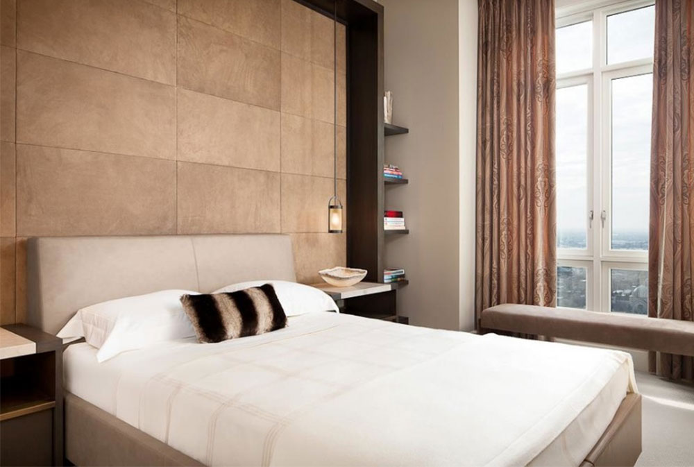
Image source: Holly Hunt
One way to determine the proper depth of taupe to use is by considering the size of the room. If the room you are designing is small, use a light tint of taupe.
When the windows are open and sunlight seeps into the room, the light will be reflected off the walls. This will allow the room to feel larger than it actually is, and, therefore, makes a small room more spacious and less cramped.
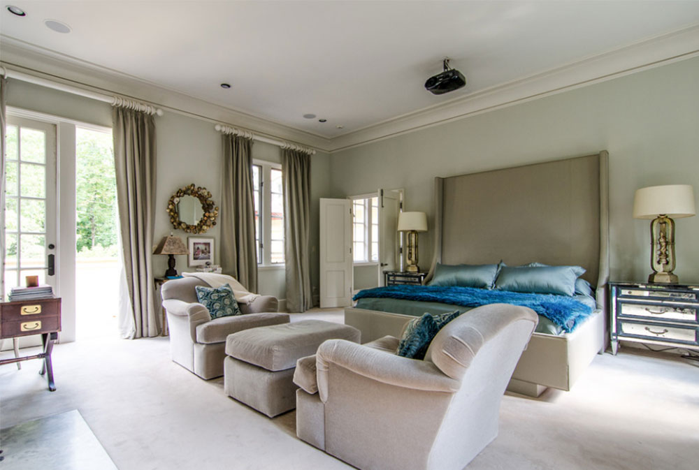
Image source: Virtual Studio Innovations
For very large and wide-open rooms, try using dark taupe paint. A wide open room can feel distant and less intimate. Adding dark taupe makes the room feel less big, creating a sense of warmth and making the room more personal. Dark taupe bedroom walls can be particularly intimate in this regard.
Using Taupe Paint Color for Northern Light
There are certain rooms that are just naturally difficult to decorate effectively. Rooms that face the north fit into this category. This is because these rooms offer little to no natural light, darkening the entire room, regardless of the time of day.
Using artificial light can make the room look even worse. If you find yourself facing this dilemma, there is a wonderful solution you could try: use grayer variants of taupe to accent the room.
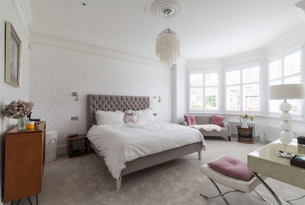
Image source: Laura Butler-Madden
Northern light can make most grays seem cold and flat. This unfortunate lighting brings out the worst qualities in normal grays. However, grays with brown undertones are strong, dark colors that combat the poor lighting.
This is why taupe can be so much more effective in these of rooms than most other colors. If you’d like to keep the sophistication of grey in a northern room, you can use taupe and grey in combination. Think grey and taupe bedding in a northern bedroom.
Taupe gray paint plays along with the northern light while still retaining all of its magnificent qualities. Taupe, being a color that naturally reflects light, also bounces the light around, allowing you to capture as much light as possible without having to use incredibly bright colors.
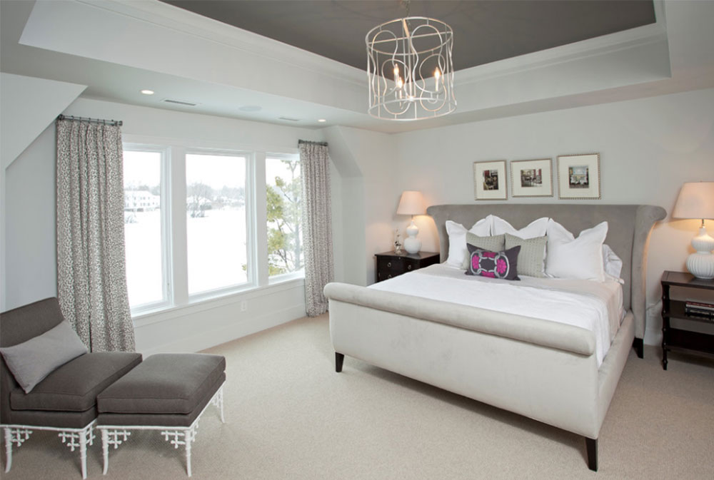
Image source: REFINED LLC
Using Taupe Color for Southern Light
Southern rooms are absolutely great and are nowhere near as much trouble as northern rooms can be. Southern rooms, as opposed to northern rooms, have plenty of light coming in.
Because of this great lighting, you can freely use any temperature, tint, or shade of taupe because it will all look magnificent in the flood of light. Here are a few tips you can use to give your room certain effects by utilizing the light and taupe colors.
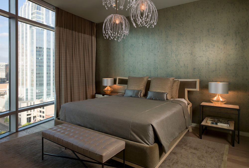
Image source: Laura Britt Design
If you want your room to feel spacious and airy, consider using light tones or warm variants of taupe for your walls. This makes the entire room feel light and vast. If you want a cozy, intimate room, use darker shades of taupe wall color.
Using Taupe Color for Eastern Light
We have talked about the horrible northern lighting and the gratefully perfect lighting of southern rooms. Now, it is time to talk about the middle: east rooms.
The mid-light in east rooms works in perfect favors for blue walls. If you are using cool blues for the room, accent it with shades of taupe to prevent the room from becoming depressing or seeming too clinical.
Adding tints of taupe to green based blues is a good idea because it makes the room warmer and more comfortable. Your room doesn’t have to be truly taupe but can benefit from color accents.
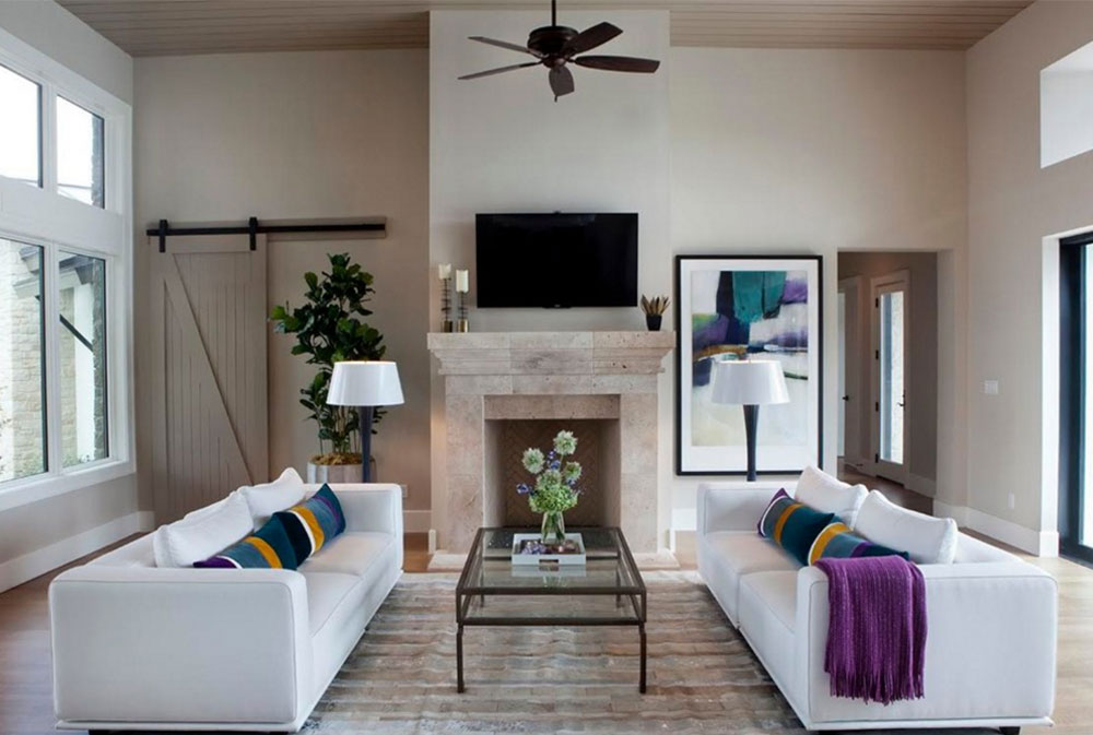
Image source: Kim Ledlie Design
Choosing the Right Finish for Taupe Rooms
So, by this point, you should have a good idea of what undertones and depths to use for your taupe rooms. Now you should start considering what finish to use. For those of you who may not already know, a finish is how you complete a decoration by giving it an attractive surface appearance. It is just an extra way to enhance the theme of your home or give a room a certain effect.
Finishes may not seem like much, but be wary. It does not matter if you have everything else right, from the undertones to the accents to the texture of the furniture, the wrong finish can mess up everything and turn a potentially great room into a tacky mess. No one wants to get this far in designing their home just to have the unfortunate experience of choosing the wrong finish.
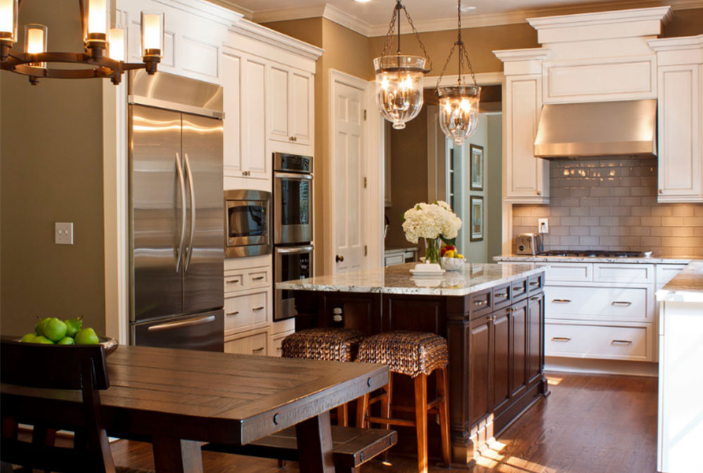
Image source: Great Spaces!
For areas that are not prone to have as many guests, such as the bedroom, workroom, or dining room, use an eggshell finish in taupe grey paint. For areas that do experience a lot of people, such as the kitchen, living room, bathroom, or playroom, use a lighter tint of taupe paired with a higher sheen finish. This makes the room more glamorous and charming. A gloss, satin, or something similar is a good idea for a finish because these are all easier to wash than alternatives.
Higher sheens also reflect more light than alternatives. This can work either against you or in your favor. Be sure to consider how much light you need and how you can utilize extra light before choosing a finish. Also keep in mind that since higher sheens reflect more light, that additional light will point out any and all damages and imperfections on the walls.
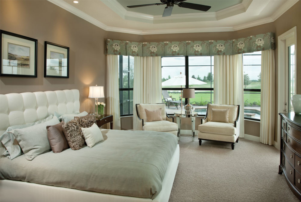
Image source: Arthur Rutenberg Homes
Using Taupe for Your Kitchen
The kitchen is an important place in any home. This is where food is made, and in homes with a dining room, this is where food is eaten. Since so much thought, time, and energy is put into making a meal in this room, you should also put thought, time, and energy into giving this room the perfect design. After all, what better way to spend an evening than with an incredibly delicious meal and a beautifully designed kitchen?
Rustic Designs
If you are wanting a rustic look for your kitchen, use deep taupe shades for the cabinets. Use that in addition to white floors, a wooden cooking vent, and copper insertions for the desired look.
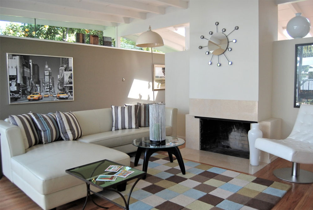
Image source: Stage Struck
Another way to get a rustic kitchen is by pairing the taupe grey color cabinets with rustic red and creamy white. The smooth nature of the rustic red complements the creaminess of this shade of white. They combine to create the ultimate effect of gentleness coupled with elegance and balance. These colors create a seamless design that feels as though it could (and should) go on forever.
They also cater to your sweet-oriented taste buds, making this theme great for a kitchen to give people an appetite! To obtain your rustic look, include some wood tones. Use wood for the central island or the cooking vent. Rustic red, cream white, and taupe go together greatly to turn a modern kitchen into a rustic atmosphere.
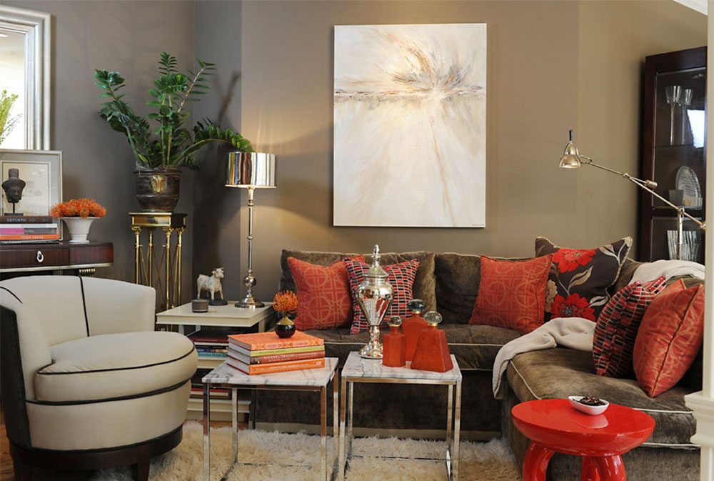
Image source: Brian Dittmar Design Inc.
Using an Exposed Brick Wall
Want something more original for your kitchen? Consider adding an exposed brick wall. An exposed brick wall can offer a sense of history in a modern home. It can be comforting and give one a connection to the past.
It can also create a sense of sturdiness that can help someone feel secure and calm. Brick wall décor also adds a touch of elegance and sophistication to the room.
It gives a glance at your personality, suggesting strength and tradition. It can also just be a great way to spice up your kitchen, rather than going with the usual, bland drywall or glass.
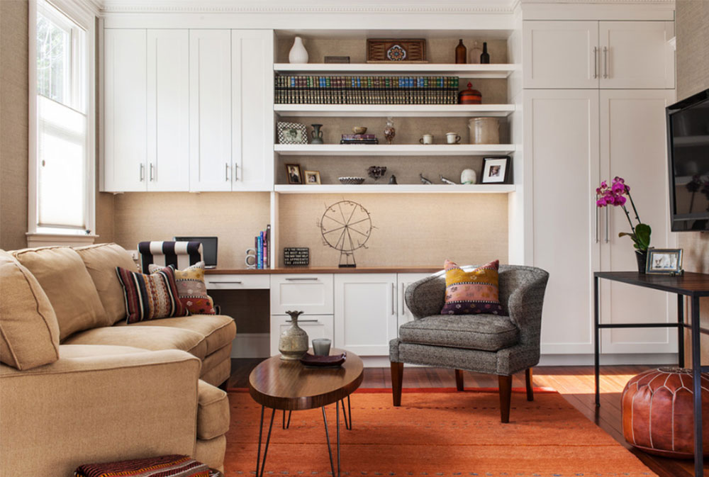
Image source: Sean Litchfield Photography
If you want to use a brick wall to achieve a different version of a rustic kitchen, here is how you can. Use a regular white—the color of purity—and the texture of bricks to your advantage.
Just the brick wall itself creates the rustic feel, so there is no need to worry about different colors throughout your kitchen unless you want your kitchen to seem as rustic as possible. The brick wall can also be used to hold spices and fresh herbs, giving the wall an even more natural and rustic look and feel.
Image source: Scorpio Craftsmen Inc
Another way to utilize a large brick wall in the kitchen is by placing a light taupe or white colored marble counter in front of it. This way, the wall is not the center of attention. Instead, it serves as a nice way to accent the room and incorporate a bit of variety. To modernize the look you can show the color taupe in an accent wall and insert a stainless steel sink.
You can include some splashes of color throughout the kitchen to draw attention away from the wall while at the same time contrasting with it. A picture on the brick wall has a similar effect without leaving the wall bare.
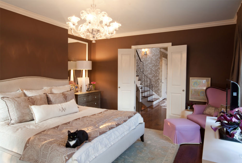
Image source: Traditional Bedroom
Regardless of how you use a taupe color in your kitchen, it is sure to create a warm and cozy feeling throughout this very special room of the house.
Ending thoughts on using the color taupe
Taupe is a color that not many know of, but that does not mean it is ineffective! Taupe is a unique color, taking the best properties of both gray and brown and using them to its advantage. Taupe is a neutral color that can reduce stress. In terms of personality, taupe is calm, mature, reliable, and welcoming.
This color can work well in any room of the house. Even if the room has poor natural lighting, there is still a way to make taupe work for you.
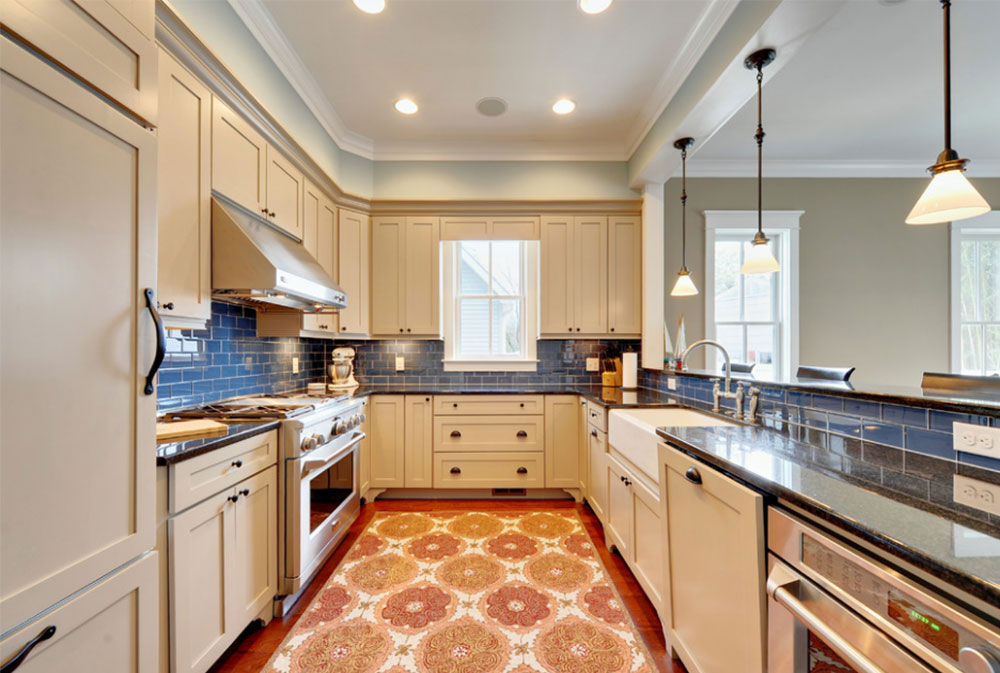
Image source: Echelon Custom Homes
This elegant color can be used as a backdrop, or it can be used to accent brighter colors. It comes in a wide variety of tints and shades, so be sure to explore them all before settling on the right one.
In the kitchen, taupe can contribute to creating a beautiful rustic design, or it can make an exposed brick wall more interesting. Taupe can work very well with colors you would never have suspected. Experiment with different variants of taupe and other colors to find the perfect combination.
Image source: Brett Mickan Interior Design
This underrepresented color is slowly but surely gaining popularity. And it is not hard to see why! This color is incredibly flexible and can work well in a variety of situations. Next time when you are wondering what color to use for your home, consider all that the unusual color taupe.
FAQs about the color taupe in interior design
1. What is taupe, and how would you describe its shade in interior design?
A combination of grey and brown with variable saturation levels, taupe is a neutral color. Depending on the undertones, its shade in interior design can range from warm to chilly. Taupe is a multipurpose hue that works well in home design as a background or accent color.
2. What colors complement taupe in interior design?
In interior design, taupe works well with a variety of colors. Cool hues like blue or green, warm hues like red or orange, or even more neutral hues like white or black might complement it. Silver or gold metallic elements match well with taupe as well.
3. Is taupe a warm or cool color, and how can it affect the overall ambiance of a room?
Depending on the particular tint, taupe can have undertones that are either warm or chilly. While cooler taupes have more gray undertones, warmer taupes contain brown undertones. The overall atmosphere of the space can be changed by the warmth or coolness of the shade, making it feel cozier or more upscale.
4. How can taupe be used as a neutral base color in interior design?
Because it blends well with so many other hues, taupe is a fantastic neutral base color to utilize in interior design. It can be utilized to create a unified look that lets other items in the room stand out on walls, floors, or larger pieces of furniture.
5. What are some popular accent colors to pair with taupe in interior design?
Blues, greens, pinks, and purples are common accent hues that go well with taupe in interior design. To add splashes of color to a space that is mostly taupe, these hues can be employed in decorative accents like throw pillows, curtains, or artwork.
6. Can taupe be used as the primary color in a room’s design scheme, or is it better suited as an accent color?
Depending on the desired effect, taupe can be used in interior design as both the main hue and an accent color. It can be used as an accent color or as the dominant hue in a monochromatic color scheme.
7. How does the texture of materials and fabrics affect the way taupe appears in interior design?
The appearance of taupe in interior design might vary depending on the texture of the materials and fabrics. A taupe leather or suede material will look and feel different from a taupe linen cloth, for instance. Textured fabrics may give a space with a lot of taupe depth and intrigue.
8. What are some popular decorating styles that incorporate taupe in their design scheme?
Modern, farmhouse, and traditional decorating designs are common ones that include taupe in their color palette. Due to its neutrality, taupe blends well with a number of design aesthetics.
9. Is taupe a timeless color, or is it considered a trend that will eventually go out of style in interior design?
In interior design, taupe is regarded as a classic hue. While fashions come and go, taupe is a timeless color that works well with a variety of design aesthetics. It is a preferred option among designers and homeowners due to its adaptability and capacity to complement different hues.
10. What are some ways to add depth and dimension to a room that is predominantly taupe in color?
If the space is mostly taupe, think about using various textures, patterns, and finishes to provide depth and perspective. This can entail utilizing a range of textiles, including metallic accents, or wood or stone components. A sense of depth in the space can also be achieved by layering various tones of taupe.
If you liked this article, you should also check out: